Over the past year we have seen a number of different methods used to predict the trends of COVID-19. However, not all models provided promising results and only few employed multivariate datasets. At the same time, most
research findings were not well presented to the public but only in the literature. In this project I focused on the UK data, found that the usage of government stringency, vaccination and testing data improved the accuracy
of COVID-19 cases forecasting, while vaccination and historical cases data improved the accuracy of COVID-19 deaths forecasting. I implemented LSTM models with accuracies of 94.3% and 96.2% for cases and deaths forecasting,
and ARIMA models with accuracies of 89.8% and 90.4%. Three-week forecasts for COVID-19 cases and deaths data along with various other visualisations were then integrated into a dashboard, which performed very well both in
information presentation and usability.
Coronavirus disease (COVID-19) is caused by the Severe Acute Respiratory Syndrome Coronavirus 2 (SARS-CoV-2) and has had a worldwide effect. On 11 March 2020, the World Health Organization (WHO) declared it a pandemic, pointing
to the more than 1.6 million COVID-19 cases in over 110 countries and territories around the world at the time.
Today, the number of cases has exceeded 151 million, while more than three million people have died. The UK was one of the countries hardest hit, but with the good progress the Mass Vaccination Programme has made since 8
December 2020[1], we can now hold a more optimistic attitude.
At the same time, machine learning has been applied extensively in this pandemic. We have seen a variety of predictive models using different methods and approaches to inform policy development and help tackle the pandemic.
However, not all models provide convincing predictions, and the research findings are not well presented to the public.
In this project, I want to explore the various forecasting methods that can be used for COVID-19 forecasting and determine the best approaches. At the same time, I would like to develop a dashboard to informatively present the
findings and make them accessible to everyone. Research gaps and technical-detailed motivations can be found in Section 2.3.
All the data presented in this report are as of 20 April 2021.
1.2 Aims and Objectives
In line with the motivation, this project has the following aims and objectives:
Explore statistical and machine learning models for COVID-19 cases and deaths forecasting in the UK and to understand their mechanisms and performance differences.
Explore multivariate datasets used for deep learning (LSTM) models for COVID-19 cases and deaths forecasting and determine which factors improve the accuracy of each forecast.
Use the best models to provide three-week forecasts for UK COVID-19 cases and deaths data.
Explore visualisation strategies to present the UK and world data and the model predictions.
A deployed dashboard that integrates well with all of the above and performs well in terms of information presentation and usability for both technical and non-technical audiences.
1.3 Report Structure
This report contains six chapters:
Chapter 1 presents an introduction to the project and the report.
Chapter 2 presents the project background, including a literature review and the related work.
Chapter 3 presents a step-by-step methodology used throughout the life cycle of the project.
Chapter 4 presents the experiments and evaluation during the development phase.
Chapter 5 presents the discussions and evaluation during the deployment phase.
Chapter 6 presents the project conclusions and reflection.
Chapter 2 Background
This chapter presents the background of the project, including a literature review of COVID-19 forecasting methods and a comparative analysis of existing COVID-19 dashboards, then reiterates the research gaps and motivations,
and finally introduces the mathematical foundations of some methods that will be used in the subsequent chapters.
2.1 Literature Review (Forecasting)
Over the past year we have seen a number of different methods used to predict the trends of COVID-19. In the early stage of the pandemic the models were mainly those produced by epidemiologists using epidemiological methods,
including the SEIR and SEIRS models[2]. However, here we need to recognise the uniqueness of the UK data in that the UK is one of the very few countries in the world that
do not publish the COVID-19 recoveries data[3], which is essential to build the SEIR model, and therefore this was not a viable option for my project.
In the literature review I will focus on the following three types of models: mathematical or statistical based models, machine learning based univariate models, and machine learning based multivariate models.
Maleki et al. developed an autoregressive time series model based on two-piece scale mixture normal distributions, called the TP-SMN-AR model[4]. It was fully mathematical and statistical based
and involved many classical autoregressive methods. The model achieved excellent results using worldwide COVID-19 recoveries cumulative data from 22 January 2020 to 30 April 2020 and fitting the last ten days, with MAPE errors
as low as 0.22% and 1.6% for the confirmed cases and recoveries forecasting respectively. Apart from the model quality, another explanation for its high accuracy may be that the data itself had a stable and consistent upward
trend over time, thus reducing disturbances to predictions.
This was followed by more studies on COVID-19 prediction based on machine learning and deep learning methods. Chimmula et al. were among the first researchers to use LSTM models for COVID-19
prediction[5] . They built a univariate LSTM model using data up to 31 March 2020 and predicted the COVID-19 transmissions in Canada. In the short term, their model predicted that the COVID-19 cases
would reach a peak in mid-April 2020, which can be considered correct, but they also made a long-term prediction that the entire pandemic could end in June 2020, which was not quite as accurate.
At the same time, LSTM models can certainly be difficult to train, as Shastri et al. built a univariate LSTM model using confirmed COVID-19 cases and deaths data up to 1 September 2020 in India and provided 30-day
predictions[6]. The study suggested that the model achieved 97.59% and 98.88% accuracy in cases and deaths predictions respectively, which was apparently unconvincing: cumulative
cases and deaths data were used in the figures presented for model predictions, the predicted values were not only inconsistent with the input data but were even declining; cumulative data should never decline. The resulting
interpretation for the one-month forecast was also proven to be inaccurate. The most likely problem with this study is that the model was over-fitted and predictions on the training data were used to measure the model
performance.
Shahid et al. provided a more robust COVID-19 predictive analysis using univariate deep learning models, including LSTM, GRU and Bi-LSTM[7]. They also experimented with statistical
models such as SVR and ARIMA. They used data for ten countries up to 27 June 2020, each with 110 days as input and 48 days as forecast output. The findings were that the Bi-LSTM models generally provided the best results, but
LSTM and GRU models can perform better for some countries; the deep learning models outperformed the statistical models.
However, Barman’s study had different conclusions[8]. It also compared univariate deep learning models ( variants of the LSTM model) and statistical model (ARIMA model), and used data up to
25 May 2020 in four countries, with the following results: in many cases, ARIMA provided better results than the complex LSTM models; the vanilla LSTM model outperformed its complicated extensions (Stacked LSTM, Bi-LSTM,
ConvLSTM, etc.). The LSTM models required more training data and had more limitations, so the study suggested that ARIMA should be recommended as the baseline model for COVID-19 prediction. This result is not popular in the
COVID-19 forecasting literature, and while I believe that ARIMA models can do well in many cases, I do not consider the ARIMA models to be as robust as the LSTM models. One potential explanation for this result is that the
models in the experiment only performed short term (1/3/5 days) predictions and did not cover different phases of the data.
Yudistira saw the benefits of using multivariate datasets rather than univariate as the COVID-19 data is affected by many factors, and constructed a multivariate LSTM model in the experiment and compared it to a multivariate RNN
model[9]. In addition to the COVID-19 cases, deaths and recoveries data, the models also used the latitude and longitude of a region as input. It used data up to 1 May 2020 for 100
countries as training data and 4 countries as validation data, resulting in the LSTM model outperforming the RNN model with relatively high accuracy. The study presented the idea that a country’s geographical location has an
impact on its COVID-19 data, and while it is relatively innovative and has some data to support it, I believe the experiment would be even more convincing if it used not only geographic data but also took into account
demographic, economic, and social factors.
Chandra et al. conducted a more comprehensive experiment by comparing univariate and multivariate versions of the LSTM, BD-LSTM, and ED-LSTM models[10] . It used data for 10
Indian states up to September 2020 as input and population density as a multivariate feature, evaluated with 4-day projections and finally the best performing model was selected for a two-month prediction. The results were: the
LSTM and BD-LSTM models outperformed the ED-LSTM model overall; the univariate models outperformed the multivariate models; and the two-month predictions were accurate overall. As stated by the authors, the biggest challenge was
the lack of relevant data; the authors intended to capture data on population density, logistics and social aspects such as culture and lifestyle, but ultimately only population density was achieved, which turned out to be a
confounding factor and did not contribute to the accuracy of the model. For such a regional level study, I believe using data of lockdown measures as one of the inputs would have been very helpful.
Said et al. further improved the process of building a multivariate LSTM model for COVID-19 forecasting[11]. It first applied KMeans to cluster individual countries based on demographic,
social-economic and health sector indicator data, and used COVID-19 data for countries clustered with Qatar up to 31 June 2020 as training data, then built a multivariate Bi-LSTM model with the feature of the lockdown measures
added to perform 10-day predictions for Qatar. The training data of the model was made more relevant by clustering, and the model achieved significant improvement in the prediction performance by adding the lockdown measures
data.
Table 2.1 presents a summary of the literature review of COVID-19 forecasting methods and proposed work.
Table 2.1: Literature review of COVID-19 forecasting methods and proposed work.
2.2 Related Work (Dashboard)
Following the COVID-19 forecasting, the final project deliverable will be a integrated dashboard and it is important to first understand the existing work.
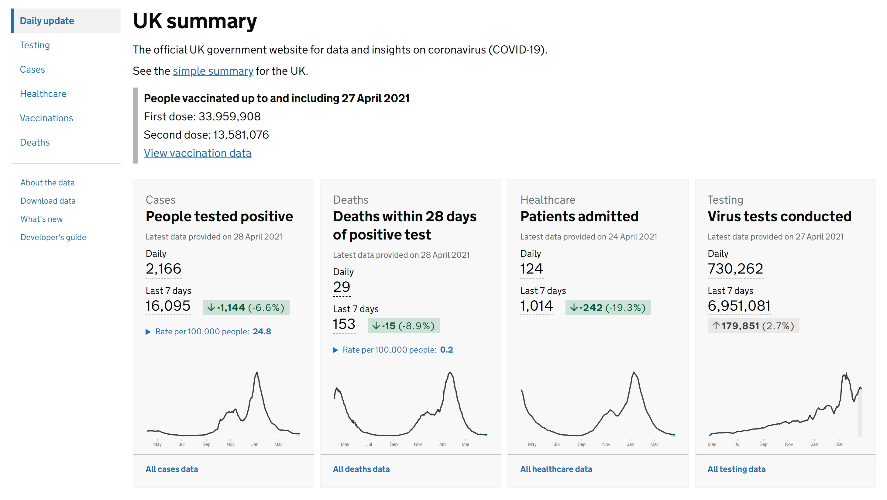
As the project is focused on the UK, we can not ignore the official UK government COVID-19 dashboard, which was developed by Public Health England[12]. As the
audience is the general public, it provides basic and essential information for all regions of the UK and is of relatively good usability. The only problem is that it has too many metrics for each data, for example, for COVID-19
cases data, it has cases by reporting date data, cases by testing data, cases by laboratory testing data, etc. This can cause confusion and reduce usability; to address this issue, they also provide a simple summary of the UK.
Figure 2.1 contains a screenshot of the official UK government dashboard.
Figure 2.1: Screenshot of the official UK government dashboard[12].
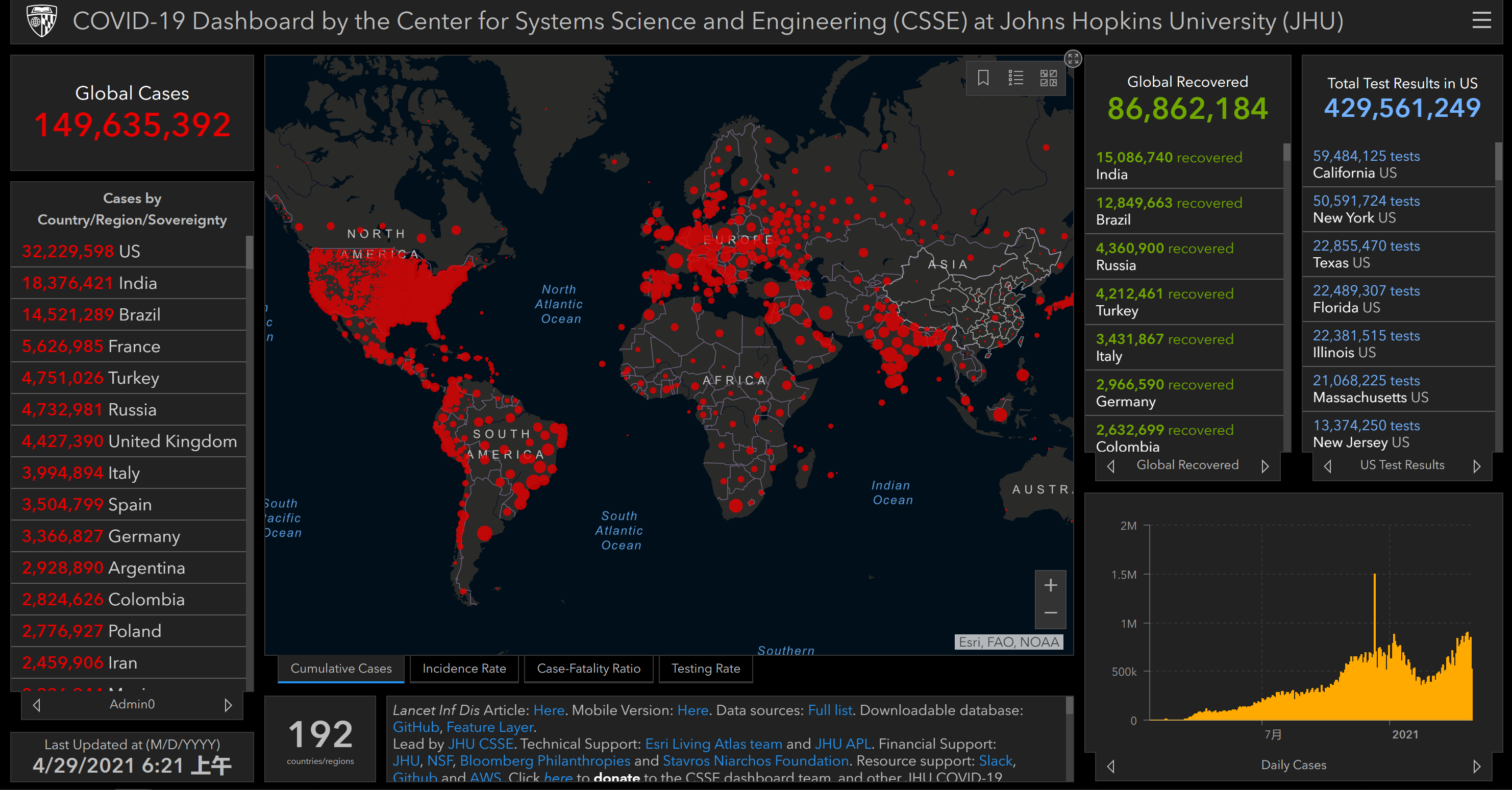
Another important dashboard was developed by Johns Hopkins University (JHU) and it has been referenced by various organisations[13]. JHU has collected data for each
country in the world since the beginning of the pandemic, and the dashboard provides the basic information presented in a map. Figure 2.2 contains a screenshot of the JHU dashboard.
Our World in Data has also developed a dashboard for the global COVID-19 data with comprehensive charts and analysis[14]. However, this dashboard is somewhat
overly complex and the hierarchy of charts is not clearly organised, making it relatively less usable.
In contrast, Bhatia provided a dashboard focusing on COVID-19 trends in different countries with good usability[15]. Figure 2.3 contains a screenshot of
Bhatia’s dashboard.
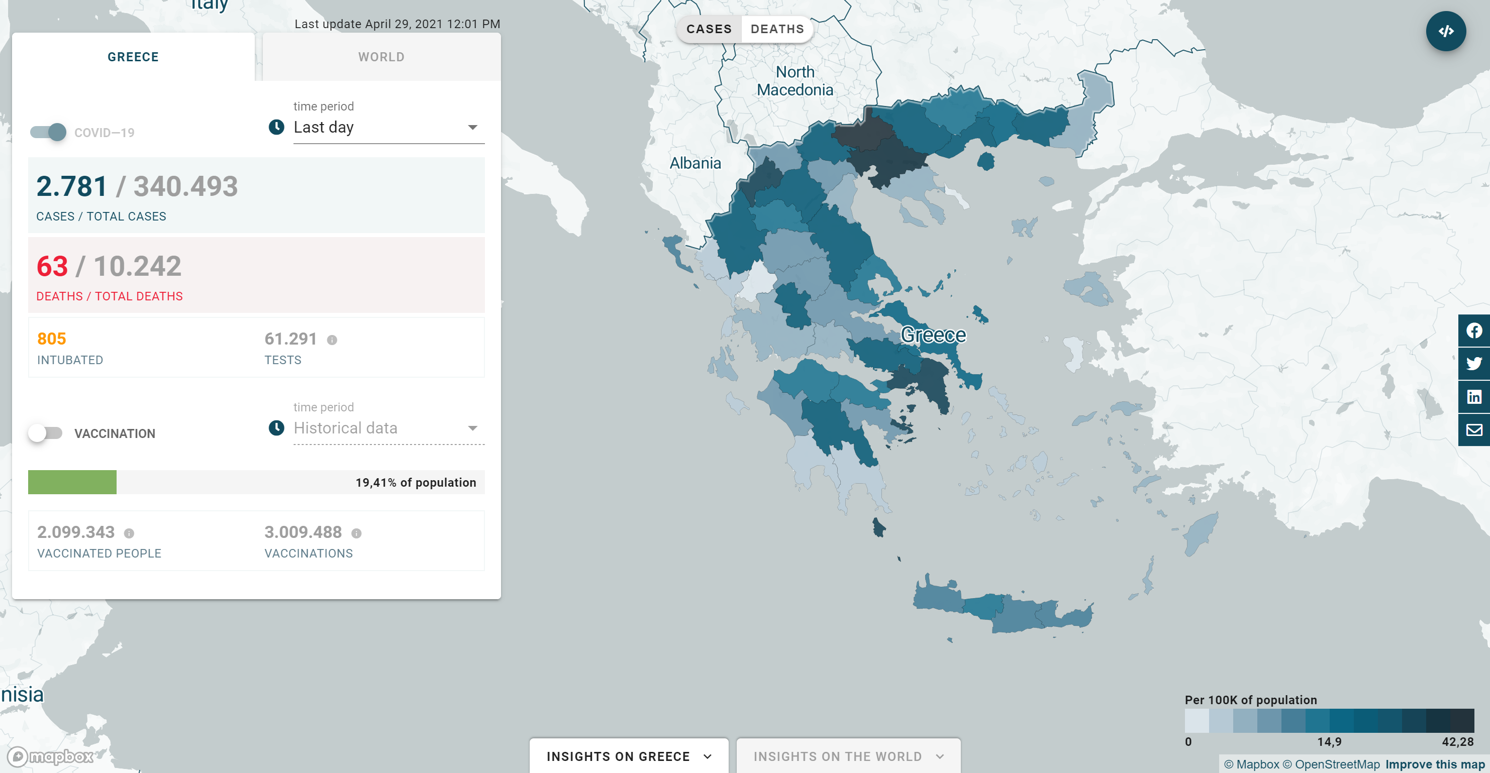
Incubator for Media Education and Development (iMEdB) developed an impressive dashboard for Greece[16]. It provides basic data about Greece and the world, and also
shows the major events in Greece as annotations. The structure is well designed and the visualisation is informative, thus the dashboard has promising usability. Figure 2.4 contains a screenshot of the
iMEdB dashboard.
Figure 2.4: Screenshot of the iMEdB dashboard[16].
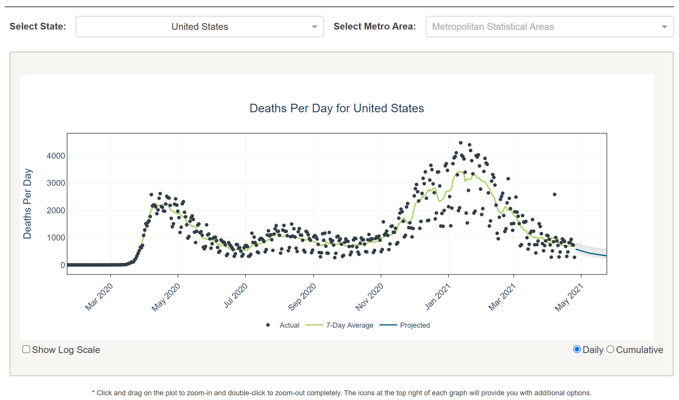
The University of Texas (UT) included a forecast in their work[17]. It provides a three-week projection for US mortality data, using SEIR and curve fitting methods. It is
simple and useful. Figure 2.5 contains a screenshot of the UT dashboard.
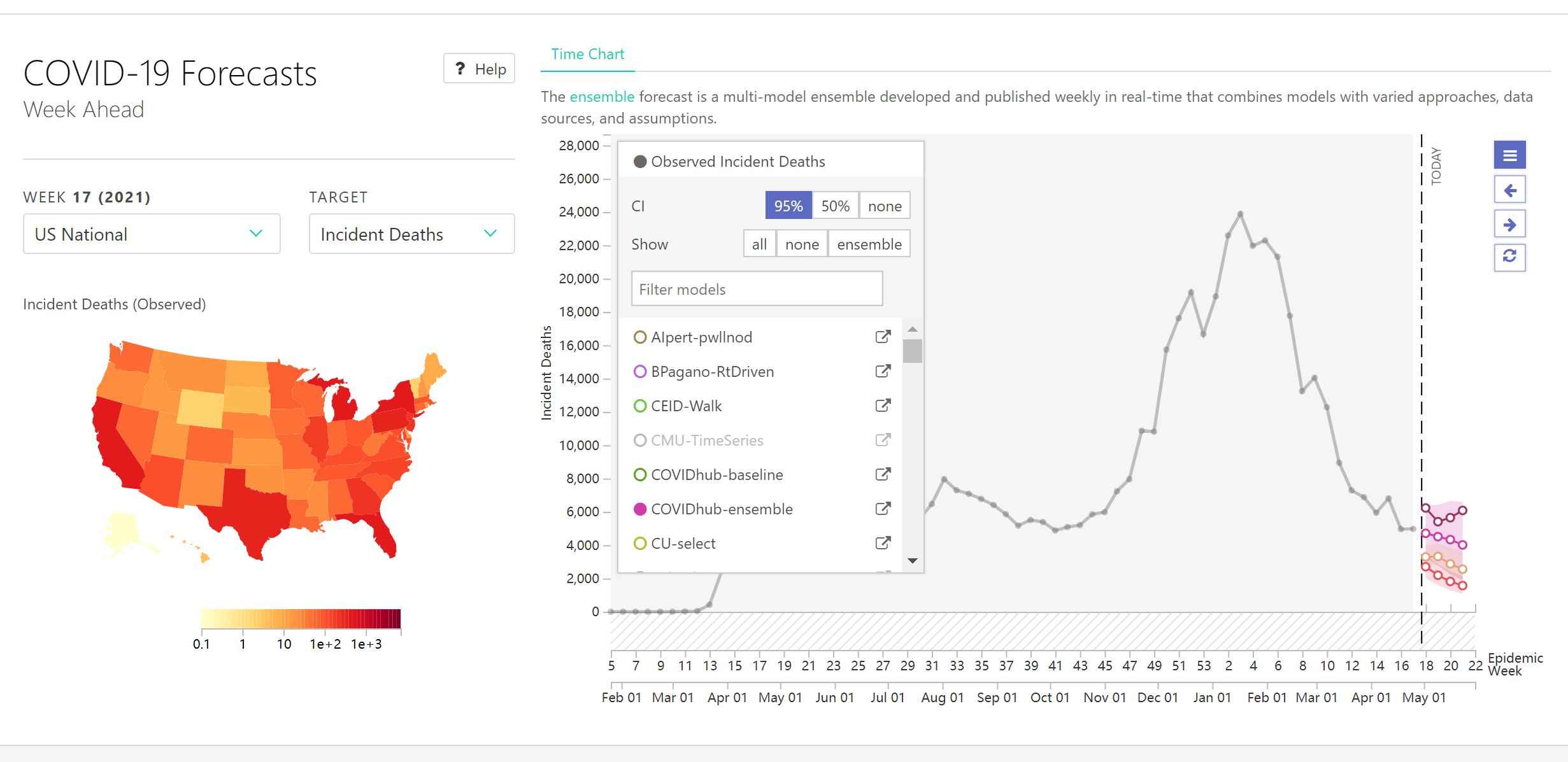
The COVID-19 ForecastHub provided a more comprehensive dashboard in terms of forecasting and is the data source for the official US CDC COVID-19 forecasting page[18]. It
integrates more than 20 predictive models, including statistical and machine learning models for US COVID-19 cases and deaths predictions. However, the different models provide very different results, making this dashboard only
suitable for technical audiences. Figure 2.6 contains a screenshot of the COVID-19 ForecastHub dashboard.
Figure 2.6: Screenshot of the COVID-19 ForecastHub dashboard[18].
Table 2.2 presents a summary of the comparative analysis of existing COVID-19 dashboards and proposed work.
Table 2.2: Comparative analysis of existing COVID-19 dashboards and proposed work, where ”complexity” and ”usability” are self-evaluated metrics scored from 1 to 5.
2.3 Research Gap and Motivation
From the literature review of COVID-19 forecasting methods, we have seen the strengths and limitations of various models, with research gaps including:
Model Selection: Different studies provided different answers as to which is better to be used for COVID-19 forecasting, statistical models or machine learning models.
Multivariate Models: The use of multivariate models has advantages over univariate models, but few studies have used multivariate datasets.
Feature Experiments: Many studies using multivariate models only considered geographical or demographic data, but did not take into account factors that have a more
deterministic impact on COVID-19 trends, such as government lockdown measures, testing and vaccination.
UK-focused Forecasting: To the best of my knowledge, very few studies have implemented forecasting methods focusing on UK data and considered different factors. This may
be partially because of the uniqueness of the UK data described in Section 2.1.
From the comparative analysis of the existing COVID-19 dashboards, we can also see some limitations of the current work:
Annotated Visualisation: Most time series visualisations did not include the social context or critical events when providing graphs of the COVID-19 data.
Forecasting Dashboards: Most of the forecasting methods described in the literature review have not been visualised and deployed, and most of the available dashboards
provide only basic information without forecasts.
Audience Acceptance: To my knowledge, most dashboards that provided predictive functionality were not accompanied by good presentation of basic information, and very few
achieved a high quality combination of the two.
Therefore, I will focus on the following in my project to overcome the above limitations:
UK-focused Forecasting: I will focus on the UK data and provide the best models for COVID-19 cases and deaths forecasting through feature experiments and model experiments
respectively.
Feature Experiments: I will construct a multivariate LSTM model and experiment with different features such as government lockdown stringency, testing, vaccination,
transmission rates, etc. and identify the features that can best improve the accuracy for both COVID-19 cases and deaths forecasting.
Model Experiments: In addition to the deep learning (LSTM) models, I will also construct statistical (ARIMA) models and find out which model will perform the best in
COVID-19 cases and deaths forecasting.
Visualisation: The visualisation should be informative and serve the following purposes, presenting the context of the UK COVID-19 data and the differences between the
different predictive models, providing a map visualisation including COVID-19 cases and deaths data for different UK areas, as well as providing an overview for the world so that people can easily understand what is
happening in different countries.
Dashboard: The aim of the dashboard is to provide a good combination of predictive functionality and basic information, suitable for both technical and non-technical
audiences with good usability.
2.4 Time Series Forecasting
In this section I will introduce the mathematical foundations of some time series forecasting methods that will be used in the later chapters.
2.4.1 ARIMA
Autoregressive Integrated Moving Average (ARIMA) model is time series forecasting model, which is a generalisation of Autoregressive Moving Average (ARMA) model. It is applied when the data show non-stationarity in the mean
sense, where an initial differencing step (corresponding to the ”integration” part of the model) can be applied one or more times to eliminate the non-stationarity of the mean. The process of first order differencing is shown in
Equation 2.1.
The AR part of the model indicates that the data to be predicted is regressed on its own lagged values, and the MA part of the model shows that the regression error is a linear combination of error terms whose values occurred
simultaneously at different times in the past[19]. An
model is represented mathematically in Equation 2.2.
Where,
and represent the time series data and its time index;
represents the lag operator;
and
represent the parameters of the autoregressive and moving average part of the model respectively;
represents the error terms.
2.4.2 LSTM
Artificial Neural Networks (ANNs) can handle complex relationships, but they cannot capture historical dependencies in the data, and the performance of the models depends substantially on the features of the
dataset[20]. A type of ANN called Recurrent Neural Network (RNN) was proposed to solve problems involving sequential data. In RNN, the current state is predicted based not
only on the current input values, but also on previous hidden state values. However, RNNs suffer from the problem of gradient vanishing and gradient exploding, resulting in RNNs not being able to learn long-term dependencies
from the data and can only be used for short-term prediction[21].
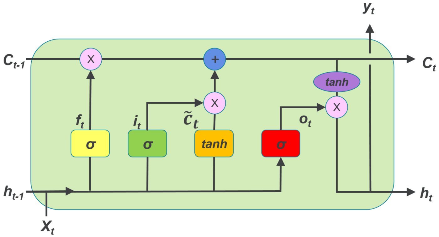
Long Short Term Memory (LSTM) networks overcome these drawbacks by employing memory cells, input gate, forget gate and output gate, and can perform much better in learning long-term dependencies. Figure
2.7 shows the architecture of LSTM.
Figure 2.7: The architecture of LSTM.
The forget gate is the first sigmoid function, which determines whether the information from the previous cell state will be preserved. The input gate donates the next sigmoid function and the first tanh function, which
indicates whether the information will be saved to the cell state. The last sigmoid function is the output gate, which determines whether the information will be passed on to the next hidden state. The process is represented
mathematically in Equation (2.3)-(2.8):
Where,
,
,
represent forget gate, input gate, output gate at time t; ,
represent sigmoid and tanh function;
,
,
and
,
,
refer to the wights and biases respectively;
,
,
represent candidate cell state, cell state and output hidden state at time t;
donates element wise multiplication of vectors.
Chapter 3 Methodology
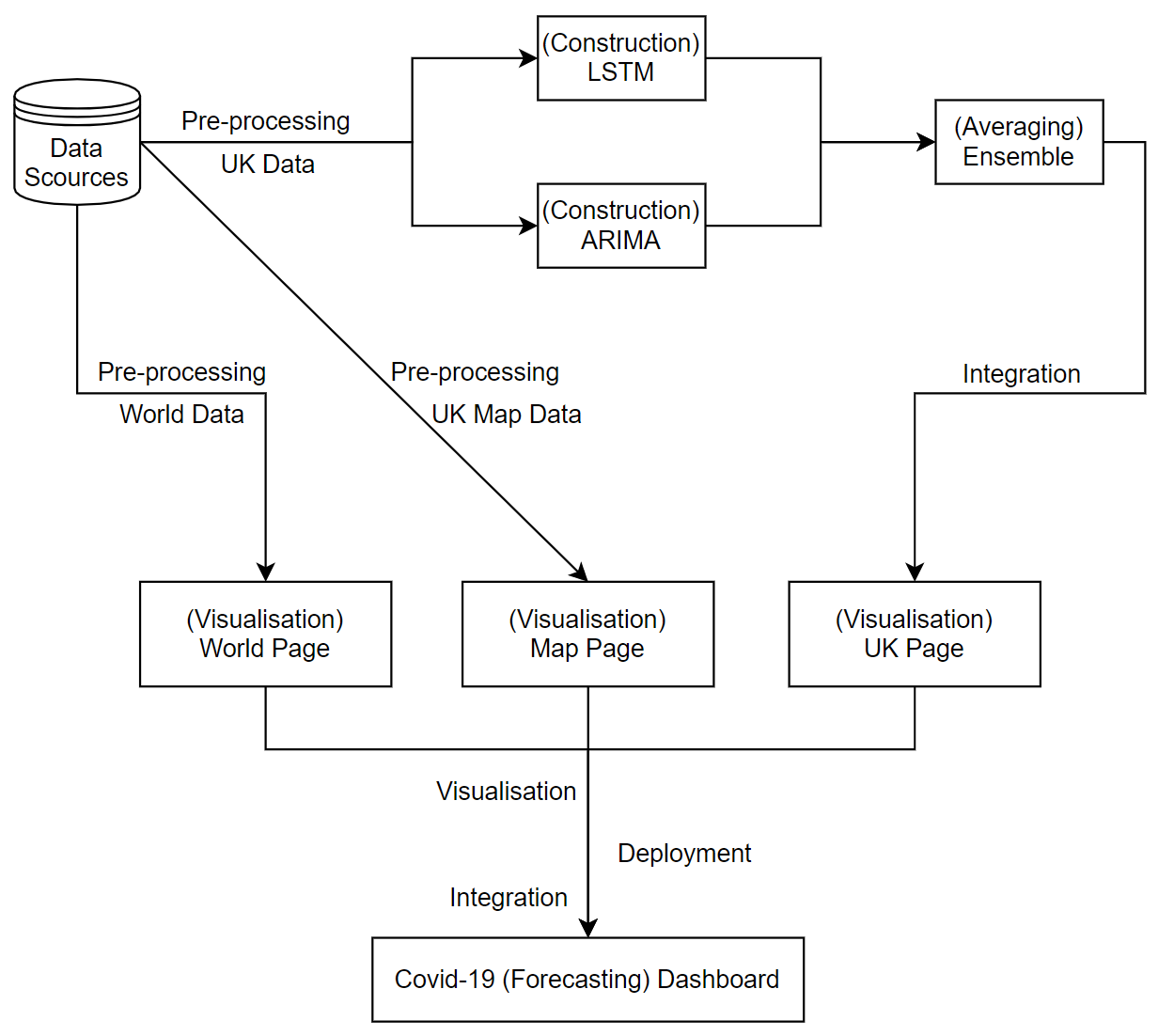
This chapter presents the step-by-step methodology used throughout the life cycle of this project, from data collection, data pre-processing and construction of deep learning and statistical models, to visualisation, dashboard
construction and evaluation. Figure 3.1 shows an overview of the project.
Figure 3.1: An overview of the project.
3.1 Data Collection
Over the past year, a variety of data sources related to COVID-19 have been released by both the public and private sectors. In this project, I used ten different types of data; for this report, all data are as of 20 April 2021.
Time Series Data (UK) - daily recorded case and death data for the UK. This dataset is provided by Public Health
England[12]. It is time-series data containing daily new cases and cumulative cases, daily new deaths and cumulative deaths in the UK. The case data is from 31 January 2020 to 20 April 2021
(from the first recorded case) and the death data is from 6 March 2020 to 20 April 2021 (from the first recorded death).
Time Series Data (world) - the cumulative number of cases and deaths recorded in 275 different countries around the world. This dataset is provided by the Center for
Systems Science and Engineering (CSSE) at Johns Hopkins University (JHU)[13]. It contains data from 22 January 2020 to 20 April 2021.
Government Stringency - Oxford COVID-19 Government Response Tracker (OxCGRT). This dataset is provided by the Blavatnik School of Government at the University of
Oxford[22]. It considers school closures, workplace closures, cancellation of public events, assembly restrictions, public transport, stay-at-home orders, internal movement restrictions,
international travel controls and public information campaigns to provide a score from 0 to 100 to measure the strictness of government responses. It contains data from 1 January 2020 to 19 April 2021.
Vaccination - the proportion of the population who have received their first dose of COVID-19 vaccines. This dataset is provided by Public Health
England[12] and contains data from 10 January 2021 to 19 April 2021.
Hospital Admissions - the number of daily COVID-19 hospital admissions. This dataset is provided by Public Health England[12]
and contains data from 23 March 2020 to 14 April 2021.
Testing - the number of COVID-19 tests performed per day. This dataset is provided by Public Health
England[12] and contains data from 31 March 2020 to 19 April 2021.
Ventilators - the daily number of COVID-19 occupied hospital beds with medical ventilators. This dataset is provided by Public Health
England[12] and contains data from 2 April 2020 to 19 April 2021.
R0 - the reproduction rate of COVID-19 infections in the UK. This dataset is provided by Francisco Arroyo et al[23]. It
contains data from 3 March 2020 to 17 April 2021.
UTLA - the latest cumulative COVID-19 cases and deaths data per 100,000 residential population for the different Upper Tier Local Authorities (UTLA) in the UK. This
dataset is provided by Public Health England[12] and contains data as of 19 April 2021.
Boundaries - the digital vector boundaries for countries and unitary authorities in the UK as of December 2019. This data is provided by the Office for National
Statistics’ Open Geography Portal[24].
Table 3.1 shows a description and usage of the different data above.
Data Name
Data Scource
Data Type
Data Usage
Time series data (UK)
Public Health England
Original Data
UK Page
Government Stringency
University of Oxford
Additional Feature
Vaccination
Public Health England
Additional Feature
Hospital Admissions
Public Health England
Additional Feature
Testing
Public Health England
Additional Feature
Ventilators
Public Health England
Additional Feature
R0
Francisco Arroyo et al.
Additional Feature
Time series data (world)
Johns Hopkins University
Original Data
World Page
UTLA
Public Health England
Original Data
Map Page
Boundaries
Office for National Statistics
Original Data
Table 3.1: Description and usage of the different data.
3.2 Data Pre-processing
Real-world data can be inconsistent and complex; therefore, a combination of different data pre-processing methods need to be utilised before we can analyse the
data[25]. In this section, I will describe the methods I used when pre-processing data for the LSTM model, both the original time series data and additional features data.
3.2.1 Original Data
LSTM models are sensitive to input, and I followed a two-step approach to pre-process the data.
Differencing: Differencing can be used to remove temporal dependencies, including trends and seasonality. It removes the level changes in the time series to stabilise the
mean[26, p. 215]. Differencing is performed by subtracting the value of the previous time step from the value of the current time step, as shown in Equation
3.1.
(3.1)
Scaling: The scale of the data will be normalised to a range of 0 to 1, which is the range of LSTM’s activation function. Equation 3.2 shows the
normalisation process.
(3.2)
3.2.2 Additional Features
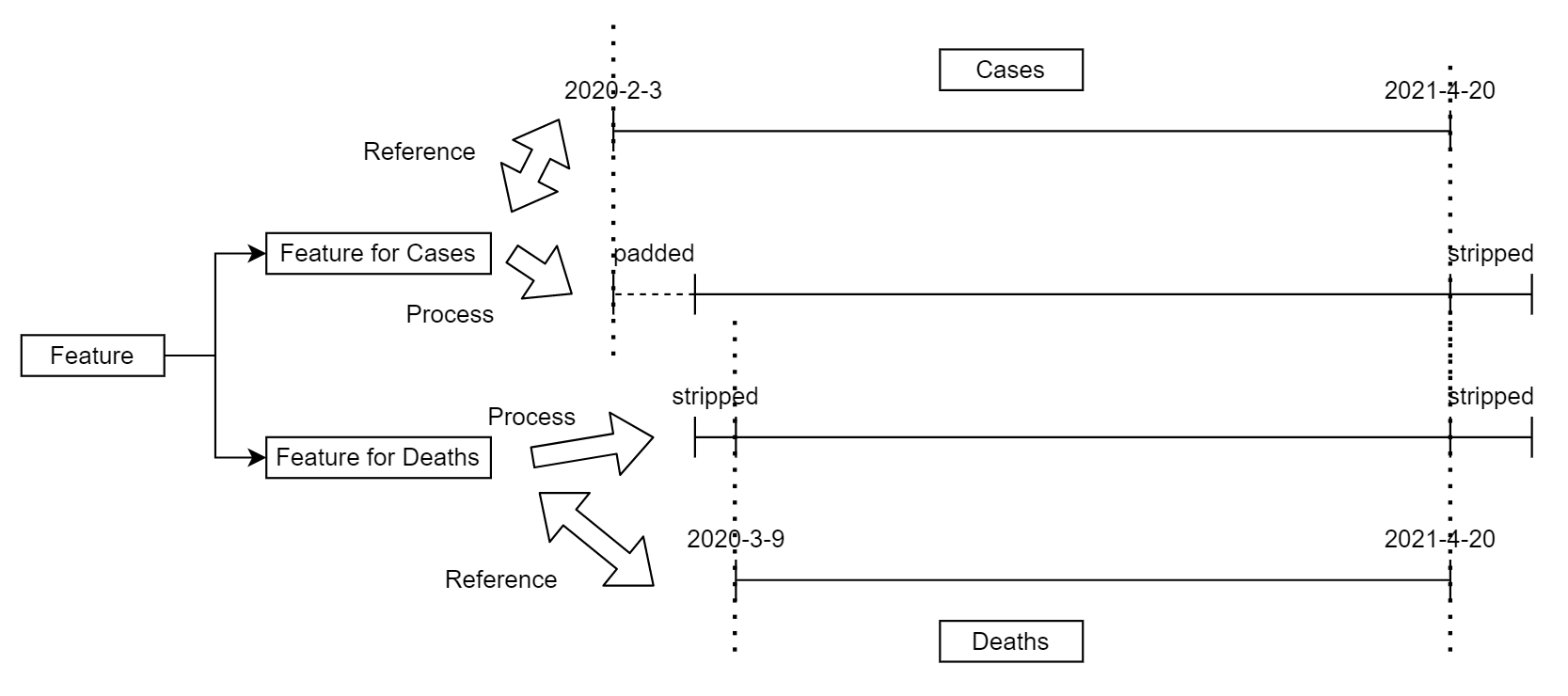
The additional features data have multiple time ranges, and it is fundamental to keep each feature consistent with the original time series data. Each feature will be processed twice to provide the correct version of the
sequence for cases and deaths forecasting. Referring to the time indices of the original cases and deaths data, padding and stripping are employed to ensure that the additional features have the same time indices as the original
data. The process is illustrated in Figure 3.2.
Figure 3.2: The process of adjusting additional features’ time indices.
Afterwards, all the additional features data are also scaled to a range of 0 to 1.
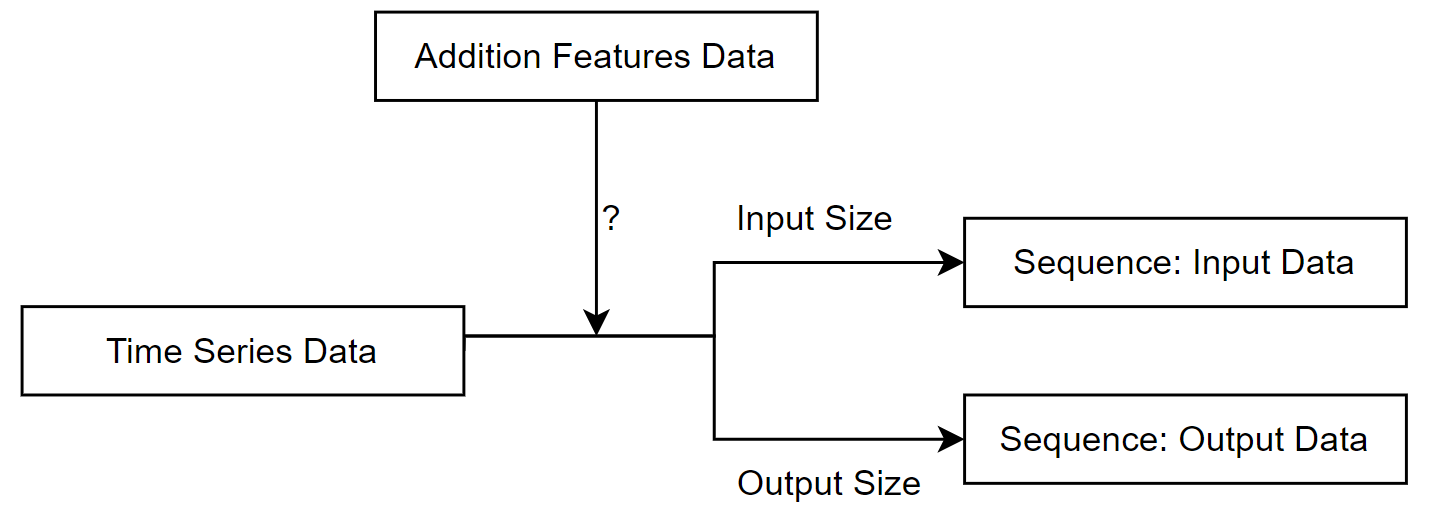
3.2.3 Sequence Transformation
After the above two steps, the data is transformed into sequences. the LSTM model requires the input data to have the following 3D structure (number of sequences, number of time steps, number of features) and Figure
3.3 demonstrates how the data is transformed into sequences. The sequences will then be used to train the model.
Figure 3.3: The process of transforming data into sequences.
3.3 Forecasting
Time series forecasting of UK COVID-19 cases and deaths data is a core function of my project. In this section, I will describe the methods employed to implement the LSTM model and ARIMA model for forecasting, as well as a
further ensemble model of the two aforementioned models, for reference.
3.3.1 LSTM
3.3.1.1 Structure
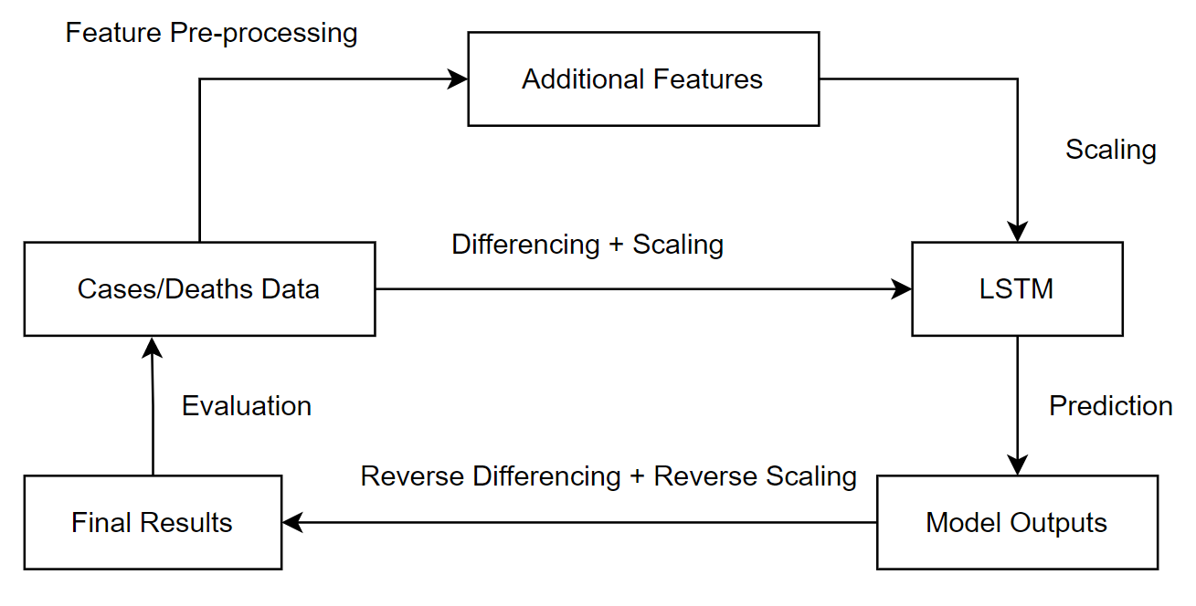
After pre-processing the original data and additional features, the selected inputs are passed into the LSTM model, which then produces multi-step predictions; for this project I chose to forecast for the next three weeks based
on data from the previous week. However, the direct output of the model is differenced and scaled, and reverse scaling and reverse differencing is required to obtain the final model predictions. Figure
3.4 illustrates the process of forecasting with the LSTM model.
Figure 3.4: The process of forecasting with the LSTM model.
3.3.1.2 Training
Adaptive Moment Estimation (Adam) is used as the optimiser. Adam optimisation algorithm is an extension of Stochastic Gradient Descent(SGD), proposed by Diederik Kingma and Jimmy Ba in 2015. Adam computes individual adaptive
learning rates for different parameters from estimates of the first and second moments of the gradient, which in practice can provide better optimisation results than other stochastic optimisation
methods[27].
Mean Square Error (MSE) is used as the loss function. MSE is the most commonly used regression loss function and is the sum of the squared distances between the actual values and the predicted
values[28], as shown in Equation 3.3.
(3.3)
3.3.1.3 Early Stopping
One of the main challenges when working with deep learning models is how long to train them. Undertraining means that the model will underfit the training and testing data; however, overtraining means that the model will overfit
the training dataset and perform poorly on the testing set[29]. Underfitting can be addressed by improving hyperparameters and increasing training epochs, and overfitting needs to be
addressed by regularisation. Early stopping is one of the oldest and most widely used forms of neural network regularisation, and it can provide an effective and simple way to avoid
overfitting[30, p. 247].
In my approach, the loss function values on the training data are monitored and if the model performance does not improve within 10 epochs, the model will stop training and the best performing model will be returned.
3.3.1.4 Dropout
Dropout is another regularisation method used to avoid overfitting when training a neural network. During the training process, some outputs of the layers are randomly ignored or dropped out. This has the effect of making the
model less complex and the remaining units are forced to probabilistically take on more or less responsibility for the inputs. This would make the model more robust by not allowing the connected network layers to co-adapt to
correct the errors from the prior layers[31].
In my approach, each LSTM layer is followed by a dropout layer with a dropout rate of 0.2, meaning that the LSTM layer is only trained on 80% of the randomly selected units.
3.3.1.5 Confidence Interval
Another feature of my project is that it not only provides a three-week forecast, but also a 95% confidence interval. However, there is no direct way to obtain 95% confidence intervals for the predictions from the LSTM model.
In my approach, I used the dropout layers to derive the prediction intervals. The process is as follows:
Enable the dropout layers in both the training and prediction phases.
Perform model predictions for 10 times and record the values.
Calculate the mean value as the model output and the 97.5% and 2.5% percentile as the upper and lower bounds of prediction uncertainty.
Equation (3.4)-(3.6) show how the model predictions and confidence intervals are calculated.
3.3.2 ARIMA
3.3.2.1 Structure
ARIMA models have three terms:
p: The order of the auto-regressive (AR) model. It is the number of previous values in the time series that will be used to predict later values.
d: The degree of differencing (Integration). It is the order of the differencing that will be performed to eliminate the trend shown in the time series data.
q: The order of the moving average (MA) model. It is a linear combination of past errors.
Each time the ARIMA model makes a prediction, a grid search is performed for different values of the 3 terms mentioned above and the model with the best performance is selected.The optimal model will then make a forecast, which
will return the predicted values for the next three weeks with a 95% confidence interval.
In my approach, p and q values are iterated from 2 to 5, while d values are iterated from 0 to 2.
3.3.2.2 Grid Search
Two types of methods are used to measure the performance of the model when performing grid searches.
Augmented Dickey-Fuller (ADF) Test: It tests for the null hypothesis that there is a unit root in the time series sample, which implies that the time series data is
non-stationary. The ADF statistic used in the test is a negative number; the larger the negative number, the stronger the rejection of the null hypothesis or the acceptance of the alternative hypothesis, which implies that
the data is stationary[32]. It is used to select the optimal d value that makes the data most stationary.
Bayesian Information Criterion (BIC): It is a criterion used to select a model from a limited set of models; the lower the BIC value the better the model performs. When
training a model, adding parameters can increase the likelihood, but it can also lead to overfitting. BIC attempts to solve this problem by introducing a penalty term for both the number of model parameters and the number of
samples used to train the model[33]. It is used to select the optimal p and q values that minimise BIC.
3.3.2.3 Stepwise
When performing a grid search, a brute-force approach iterates over every combination of parameters and can take a long time. Hyndman and Khandakar proposed a stepwise approach[34]. It
starts with four possible models, selects the model with the smallest BIC as the current best model, and then considers a number of other models, updating the current best model whenever a model with a lower BIC is found. It
reduces processing time by adding intelligent procedures for testing model orders and does not require testing all models[35].
In my approach, the stepwise method is used to perform the grid search.
3.3.3 Ensemble
The LSTM model and the ARIMA model are based on different mechanisms for forecasting and so the prediction patterns will differ for different types of data. It is helpful to understand the similarities and differences in the
performance of these two models over time, so I constructed an average ensemble model. It will return the mean of the predicted values and confidence intervals of the LSTM and ARIMA models, in the process shown in Equation
(3.7)-(3.9).
3.3.4 Cleansing
In the actual time series forecasts, there is not enough information to tell the model to set thresholds for the predictions. In particular, the cases and deaths data for COVID-19 are always non-negative integers, but the model
does not know this and may instead make negative predictions, so I performed prediction cleansing by converting all negative predictions to zero, as shown in Equation 3.10.
(3.10)
3.4 Visualisation
Visualisation is another important part of my project, which aims to provide an in-depth exploration of the COVID-19 outbreak in the UK, while providing an informative overview of the situation in different countries around the
world. It should be appropriate for both technical and non-technical audiences; in this section I will describe the strategies for visualisation.
3.4.1 Forecasting (UK)
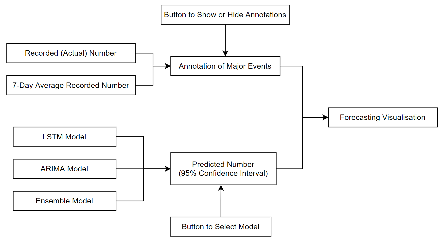
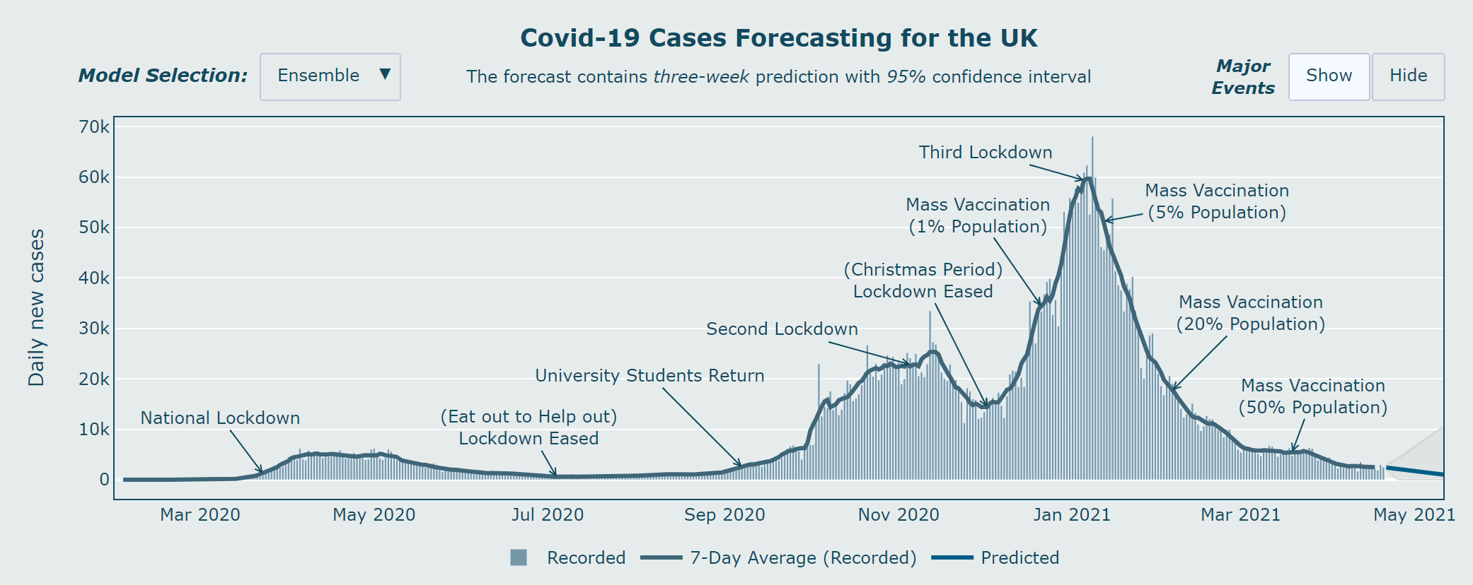
To informatively present the time series data from the COVID-19 cases and deaths data in the UK, and the predictions from the different models, I used two methods:
Predictions: The original time series data and its seven-day average data are first plotted on the graph, followed by the model predictions and 95% confidence intervals,
indicated by different colours. There is also a button for model selection where the user can select different models and see the different outputs.
Major Events: In addition to the historical data, I also chose to plot the major events during the pandemic, including the lockdowns, mass vaccination programme and other
measures. It is presented in the form of annotations that match the dates of the historical data. There is also a button for the user to choose to show or hide these events.
Figure 3.5 shows the structure of the forecasting graph.
Figure 3.5: The structure of the forecasting graph.
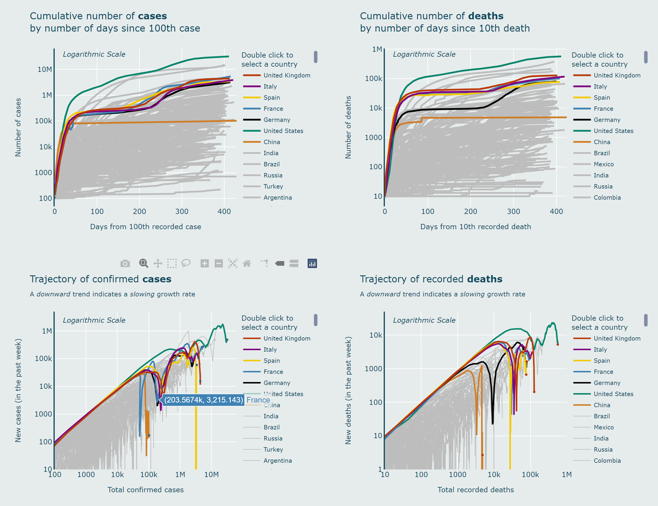
3.4.2 Overview (world)
COVID-19 is a global pandemic, and it is not enough to look at data from the UK alone. It is important for us to know what is happening in other countries, especially those that are geographically or demographically similar to
the UK, or that have other important references.
3.4.2.1 Motivation
In the most common charts (number of cases or deaths versus time), although it can give us a numerical overview of each country, it does not directly provide an easy way to understand whether the situation is getting better or
worse.
In my approach, I plotted not only the curves for different countries, but also the trajectories of different countries by plotting the logarithmic scale of the number of new cases or deaths against the total number of cases or
deaths, and it can provide us with a clear overview of the trajectories of different countries[15].
3.4.2.2 Behaviour
If a country has a constant growth rate (exponential), it will move upwards linearly in the graph; if the growth rate is getting slower, it will fall in the graph, meaning that the virus is under control; if the growth rate is
getting faster, it will rise back to the linear trajectory, meaning that the situation is getting worse.
3.4.2.3 Weekly Totals
On the Y axis, I have chosen to plot new cases per week rather than per day, not only to stabilise the graph but also to give a more robust and accurate picture of the actual trends in different countries.
3.4.2.4 Reference Countries
Johns Hopkins University (JHU) has provided data for 275 countries around the world[13], however, if we plot each country in the same way, the charts would become messy
and lack order of significance.
In my approach, seven countries are highlighted in different colours and the others are plotted with thinner grey lines. The seven countries are: the United Kingdom (the focus of this project); Italy, Spain, France, Germany
(European countries with a similar population size to the UK); the United States and China (which played important roles at different stages of the pandemic).
Due to the nature of Plotly charts[36], users will also have the option to zoom in to see more detailed trajectories or choose to view each individual country.
3.4.2.5 Adjustments
To make the chart neater and to improve usability, all country names longer than the United Kingdom will be replaced with their ISO 3166-1 alpha-3 standard[37] three-letter country code.
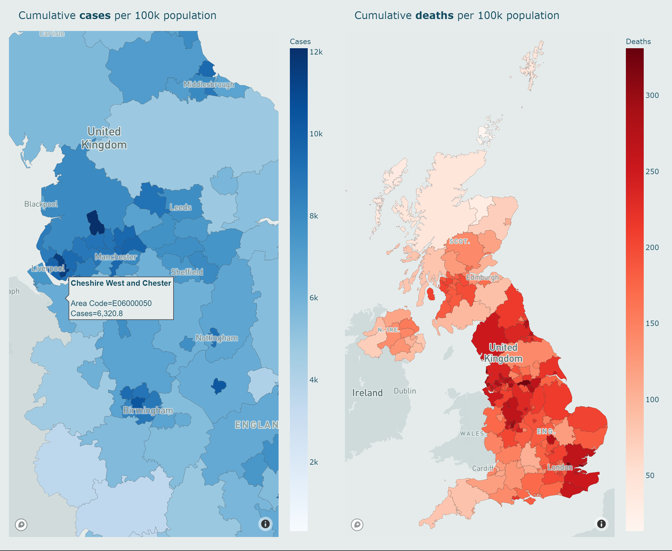
3.4.3 Maps
In addition to information at the national level in the UK, it is valuable to provide regional level data on COVID-19 infections and fatalities. Not only does it help citizens to understand the situation in the area, it can also
inform local government policies.
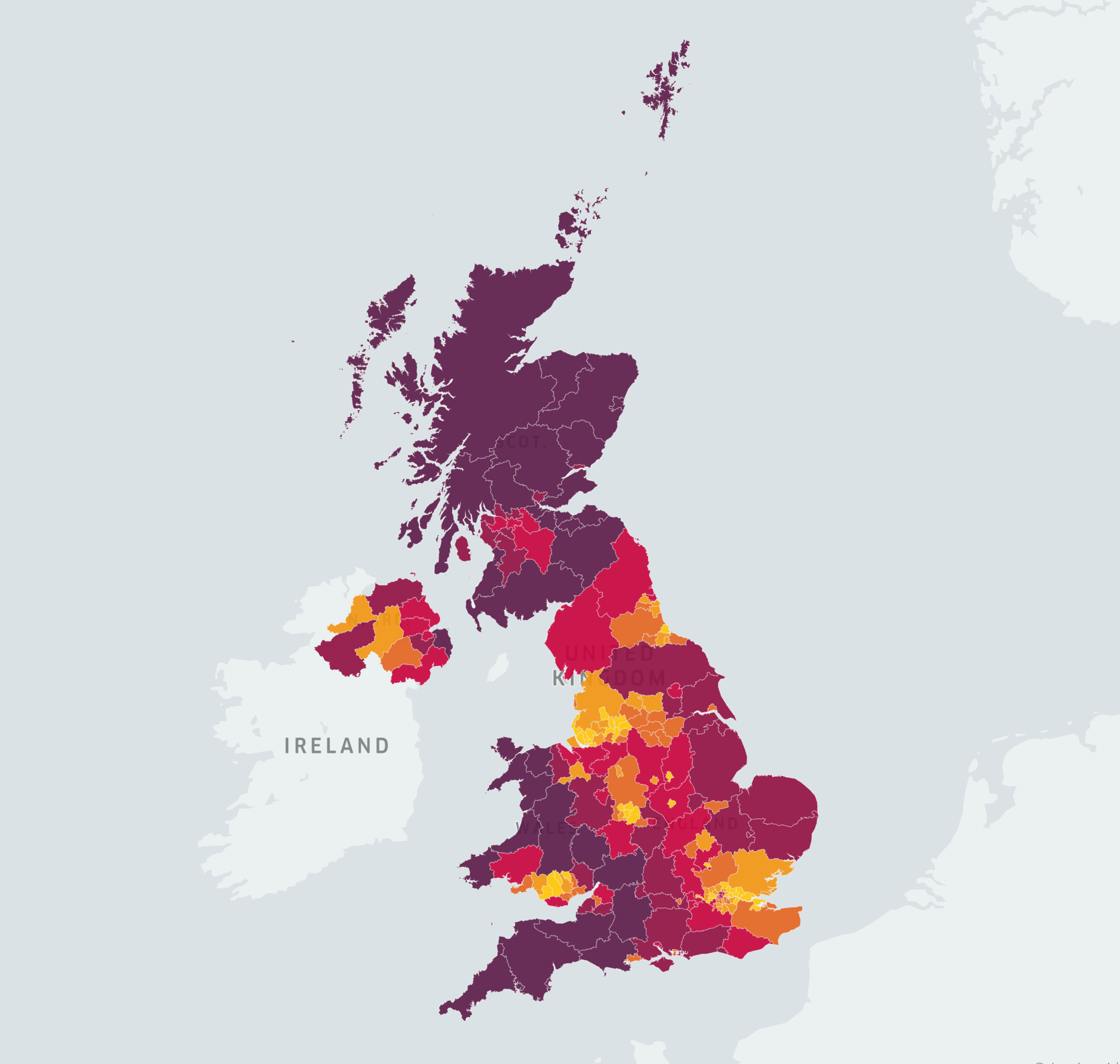
In my approach, I have chosen to map the cumulative cases and deaths data per 100,000 residential population for different Upper Tier Local Authorities (UTLA)[24].
This has the advantage that it takes into account not only the total number of cases or deaths, but also the population density, and therefore provides a more accurate regional overview. The maps of infections and fatalities are
presented in different colours, and are designed to be interactive and easy-to-use.
Notably, I also created a mapbox[38] style to match the background colour of the maps to the dashboard, thus improving the consistency of the system.
3.5 Dashboard
The integration of time series forecasting models and various visualisation strategies is the final part of my project. As it is a publicly accessible system, designed to suit both technical and non-technical audiences, the
usability of the system had to be carefully considered. In this section I will describe the user experience principles I followed when designing the dashboard.
3.5.1 User Experience (UX)
User Experience (UX) describes the user’s interaction and experience with a system[39]. When designing the dashboard, I followed 5 UX
principles[40].
3.5.1.1 Hierarchy
The first hierarchy relates to the information architecture, i.e. how the content is organised throughout the site; the visual hierarchy is how the designer helps the user navigate more easily through a section or
page[40].
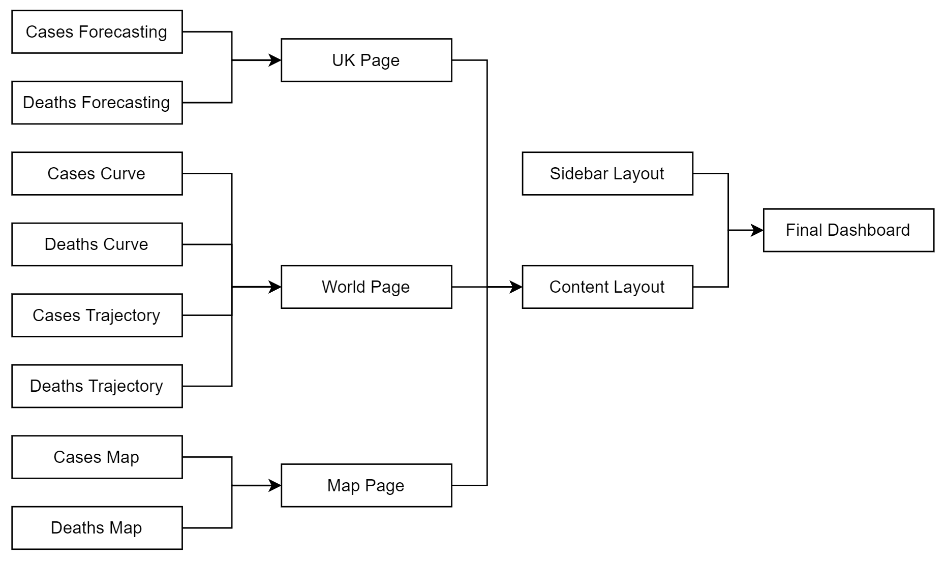
In my dashboard, there is a sidebar on the left hand side which contains the most basic and essential information, including the latest figures for the UK, last updated times, cases and deaths curves, it also has three buttons
to help the user navigate through each of the following pages: UK page, World page and Map page. Figure 3.6 contains the structure of the dashboard; Section 3.4 described how
the user can interact with each individual chart.
Figure 3.6: The structure of the dashboard.
3.5.1.2 Consistency
The entire system of my dashboard adheres well to the principle of consistency. It has several different aspects:
Colours: The background colour, paper colour and the colour used to present case and death data are consistent throughout the system.
Fonts and Styles: The style of each individual chart and the fonts used to present the different titles and information are consistent.
Navigation Toolbars: Due to the nature of Plotly charts[36], each chart has the same navigation toolbar,
including features such as zooming and area selection.
3.5.1.3 Confirmation
Error prevention is another important goal when designing a system[40]. In my dashboard, confirmation is achieved in two ways:
Feedback: When the system or any of the actions are loading, it provides a “Loading…” message in the navigation bar of the browser.
Error Messages: When the user tries to do an impossible action or goes to a page that does not exist, an error message will appear and ask the user to acknowledge it.
3.5.1.4 User Control
My dashboard provides a high level of control to the users. In addition to the functions described in section 3.4, such as model selection, country selection, showing or hiding of the major events, and
free navigation through the different pages, each individual graph also provides the following functions: saving the graph to a local device, panning, boxing, lasso selection, zooming in, zooming out, autoscaling, resetting the
axes.
3.5.1.5 Accessibility
In my dashboard, the principle of accessibility is realised in two ways:
Deployment: The dashboard is deployed on the Amazon Web Services (AWS)[41] Elastic Beanstalk, which provides a
stable connection with low response times to the system.
User Interface (UI): The user interface is logically designed and uses contrasting colours to present cases and deaths data respectively, thus improving the accessibility
of the information.
3.6 Evaluation
In my project, evaluation serves two purposes:
During the development phase: to evaluate different features, model structures and hyperparameters in order to build the best performing models. It will be presented in
Chapter 4.
During the deployment phase: to evaluate the final model, visualisation, dashboard information and usability (in line with the aims and objectives set in Chapter
1). It will be presented in Chapter 5.
In this section I will describe the different metrics and methods used to perform the evaluation.
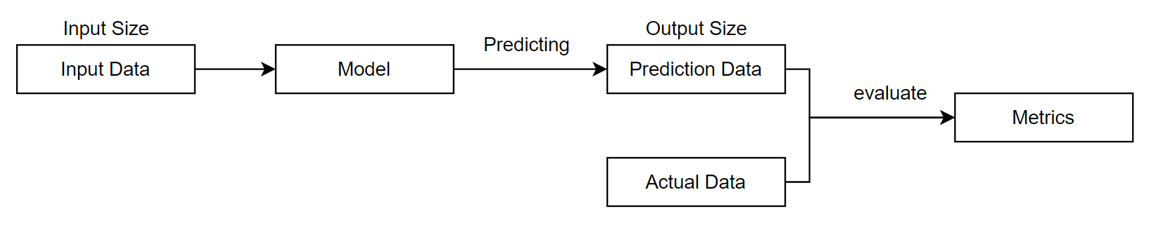
Given the input data and the model, the resulting predicted data is measured against the actual data that the model has not seen before, using three evaluation metrics:
Mean Absolute Error (MAE): the average value of absolute errors between predicted and actual data[42]. It is the
average error of daily model predictions. The calculation is shown in Equation 3.11.
Mean Absolute Percentage Error (MAPE): the average percentage value of absolute errors between predicted and actual data[43]. It is
the average accuracy of daily model predictions over the prediction period. The calculation is shown in Equation 3.12.
Percentage Mean Absolute Error (PMAE): the ratio of average absolute error between predicted and actual data against the maximum input value. It is the average accuracy of
daily model predictions over the training and prediction period. The calculation is shown in Equation 3.13.
Notably, PMAE is a model performance metric proposed by myself to address the problem that MAPE values are not constant because of data fluctuations.
Local evaluation is used during the development phase to measure the performance of a set of models and to select the best performing model.
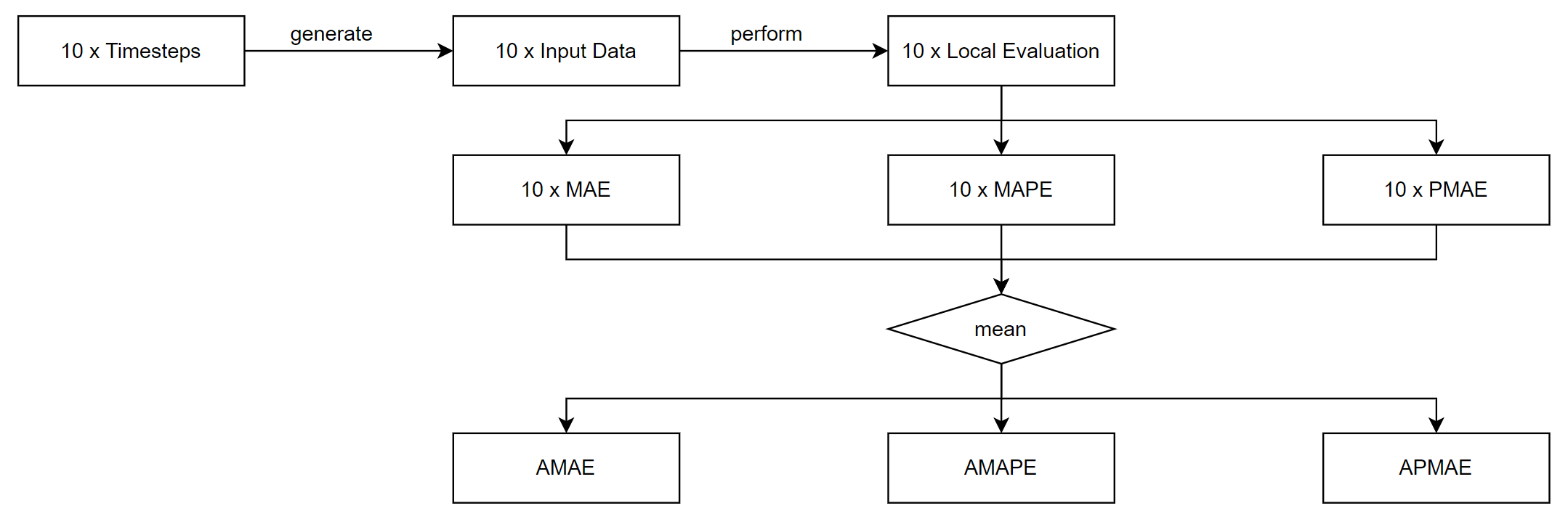
3.6.1.2 Global Evaluation
Global evaluation starts by randomly generating ten timestamps for the cases and deaths forecasting respectively: the ten timestamps should cover different stages of each data after the first lockdown (the data during the first
lockdown will be used as the minimum length of training data). These ten timestamps will be stored and will be referred to in the future when evaluating further different models.
It then uses the ten different input data produced from the timestamps to perform the local evaluation process described in Section 3.6.1.1 ten times and record the outputs for each of the three
metrics, and then calculates the average of the ten outputs and generates three new metrics: Average Mean Absolute Error(AMAE), Average Mean Absolute Percentage Error (AMAPE), and Average Percentage Mean Absolute Error (APMAE).
The calculation is shown in Equation (3.14)-(3.16); the process of global evaluation is shown in Figure 3.8.
Figure 3.8: The process of global evaluation.
Due to the stochastic nature of the LSTM model and the usage of dropout layers, there is a range of random variance in the model output each time. To address this issue, the above process will be repeated five times and the
median values will be chosen as the final outputs.
Global evaluation is used during both the development and deployment phases and is an improvement on local evaluation in that it provides a more robust and accurate performance metric for the model by covering different phases
of the data and testing multiple times. AMAE value is used in Section 3.6.1.3 to calculate the Contributing Factor (CF) value; APMAE value is referred to as the prediction error in Section
5.1.4.
3.6.1.3 Contributing Factor (CF)
Contributing Factor (CF) is a feature importance metric proposed by myself to evaluate the impact of a feature on a LSTM model. It uses a univariate LSTM model as the reference model and a multivariate LSTM model with the
feature to be evaluated as the target model, performs the global evaluation process described in Section 3.6.1.2 and obtains the AMAE values respectively, and then performs the calculation shown in
Equation 3.17.
(3.17)
A positive CF value means that the feature will improve the prediction accuracy of the model, otherwise it will reduce the accuracy; a higher absolute CF value means that the feature will have a greater impact on the model
performance, whether it is positive or negative.
Contributing Factor is used during the development phase to measure the impact of different features on the LSTM model performance and to select the features that will contribute the most to improving the prediction accuracy.
3.6.1.4 Baseline Model
To further facilitate the evaluation of the different predictive models, a baseline model was implemented. This model takes the last observed input data as its predicted value, as shown in Equation
3.18.
(3.18)
The baseline model is used during the deployment phase.
3.6.2 Dashboard
In addition to using quantitative methods to evaluate the performance of the predictive models, I also used a questionnaire to evaluate the dashboard during its deployment phase. A group of participants was recruited from both
technical and non-technical backgrounds to complete a questionnaire that encompassed two aspects of the system:
Information: how informative the system is. This set of questions is related to visualisation and presentation, participants were asked specific questions related to
information and the results were evaluated as to how accurately technical and non-technical audiences were obtaining the correct information from the dashboard.
Usability: how usable the system is. This set of questions follows the criteria of the System Usability Scale (SUS), developed by John Brooke in
1986[44], which has provided us with a quick and valid tool to evaluate three aspects of a system: effectiveness, efficiency and satisfaction[45].
Chapter 4 Development
This chapter presents the development and experiment process carried out according to the methodology presented in Section 3, and provides a discussion of feature engineering.
4.1 Data Pre-processing
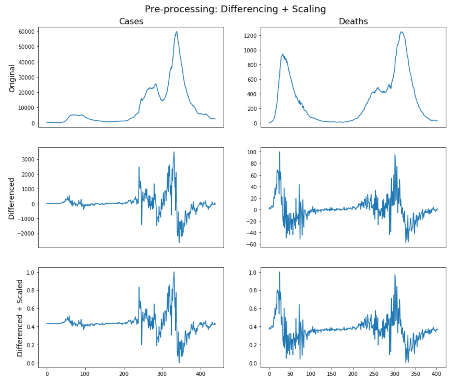
The implementation was based on Numpy[46] and Pandas[47]. Figure 4.1 shows the original data after
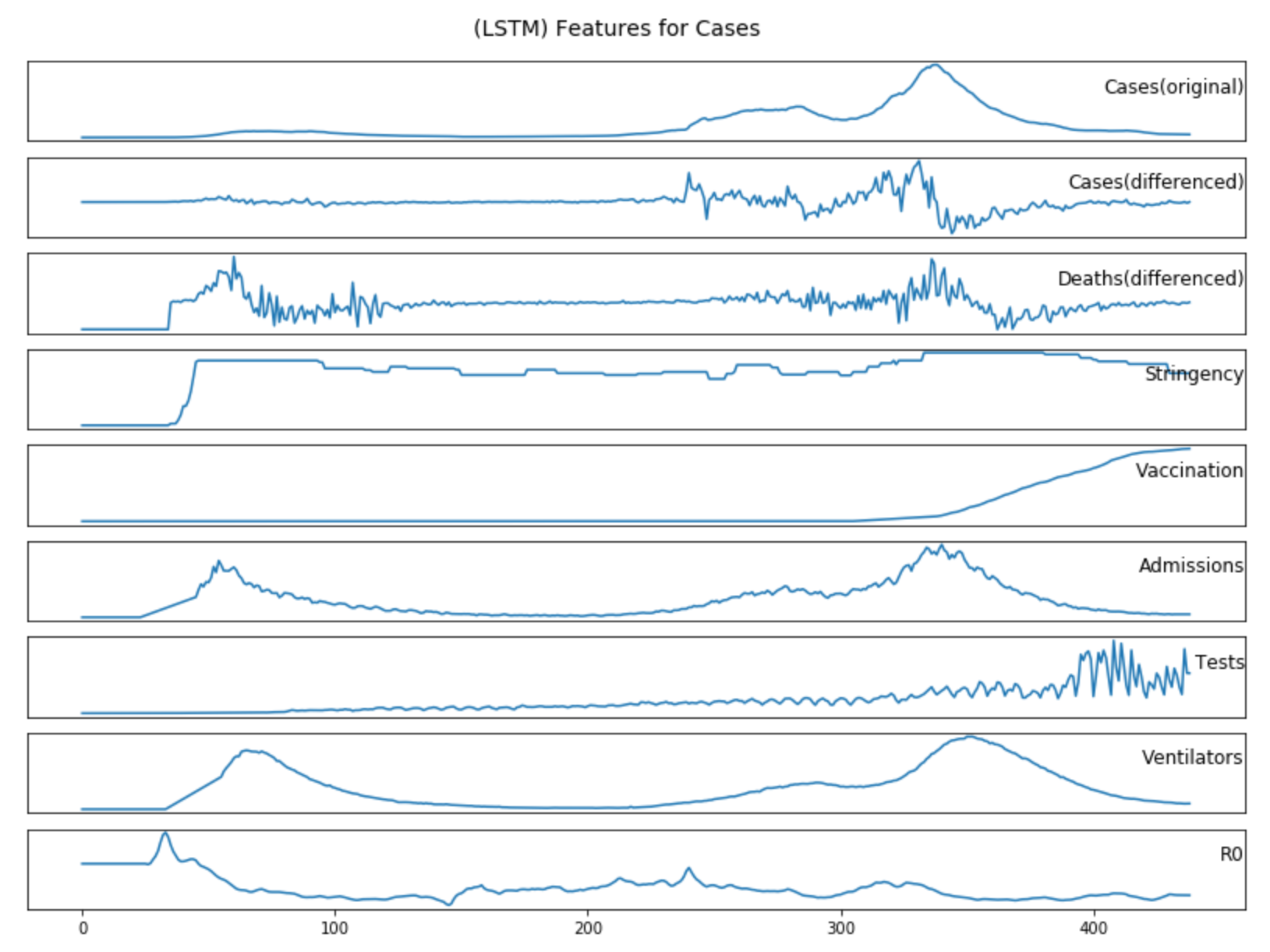
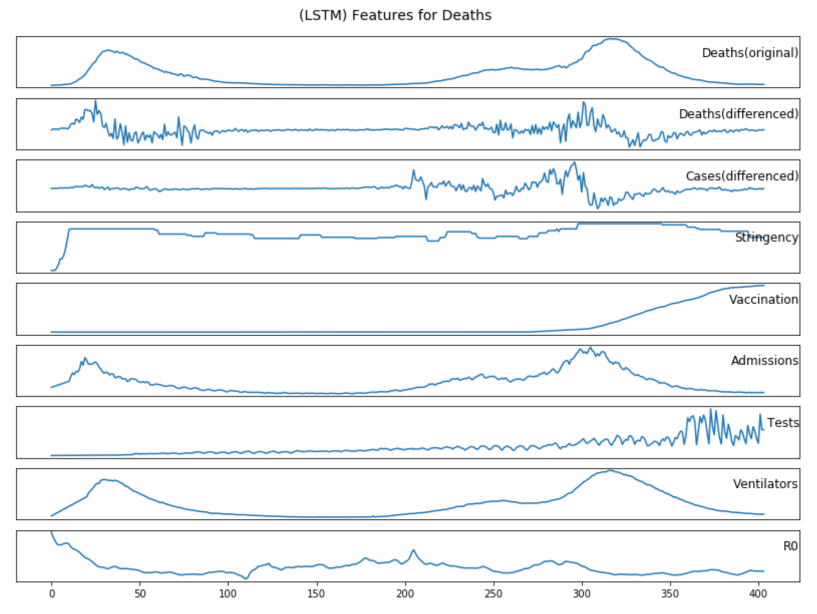
pre-processing as described in Section 3.2.1; Figure (4.2)-(4.3) show the additional features data for cases and deaths forecasting after
pre-processing as described in Section 3.2.2.
Figure 4.1: Original data after pre-processing as described in Section 3.2.1
Figure 4.2: Additional features data for cases forecasting after pre-processing as described in Section 3.2.2
Figure 4.3: Additional features data for deaths forecasting after pre-processing as described in Section 3.2.2
4.2 Forecasting
4.2.1 LSTM
4.2.1.1 Structure
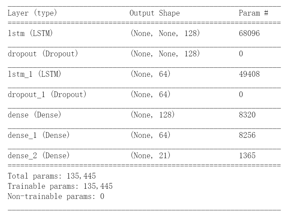
The LSTM model was developed with TensorFlow[48]. Figure 4.4 shows a summary of the model and it has the following structure:
2 LSTM layers with 128 and 64 units
2 Dropout layers with a dropout rate of 0.2
3 Dense (Fully Connected) layers with 128, 64 and 21 units
Figure 4.4: A summary of the LSTM model.
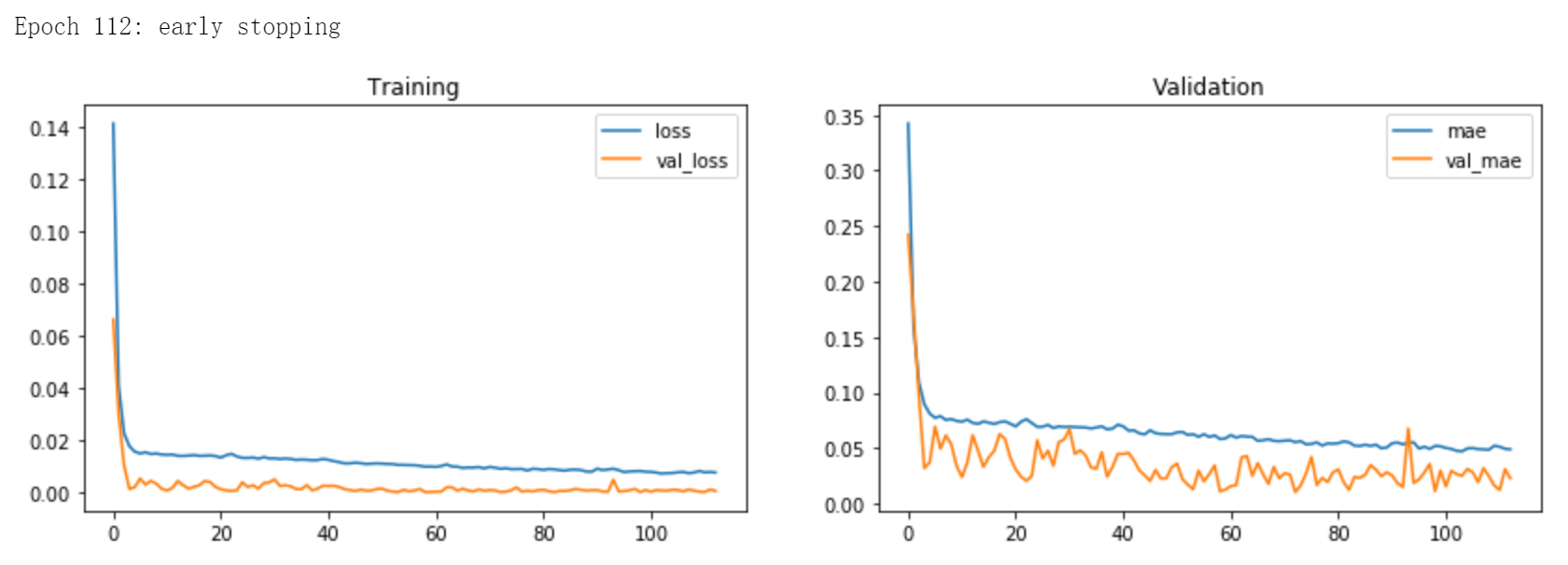
4.2.1.2 Training
In line with Section 3.3.1, with Adam as the optimiser, MSE as the loss function, and Early Stopping and Dropout as the regularisation methods, Figure 2 shows an example of the training process of
the LSTM model.
Figure 4.5: An example of the training process of the LSTM model.
The training process was carried out on a NVIDIA GeForce GTX 1050 Graphics Card[49].
4.2.1.3 Feature Experiments
Using the global evaluation method as described in Section 3.6.1.2, I firstly used the univariate LSTM model as the reference model, then tested over the seven different features for cases and
deaths models respectively. Table 4.1 contains the experiment results, where the calculation of the Contributing Factor (CF) value is described in Section 3.6.1.3.
Features/
Metrics
Cases
Deaths
MAE
MAPE
PMAE*
CF*
PMAE
MAPE
PMAE*
CF*
Reference
3025
21.1%
6.3%
0
70
39.8%
6.0%
0
Time Series
3278
19.8%
6.7%
-8.4%
44
34.1%
3.8%
37.1%
Stringency
2699
15.8%
5.7%
10.8%
233
244.4%
20.5%
-232.9%
Vaccination
2740
14.4%
5.9%
9.4%
62
25.9%
5.4%
11.4%
Admissions
3263
26.7%
7.0%
-7.9%
88
79.5%
7.7%
-25.7%
Tests
2752
16.4%
5.8%
9.0%
106
60.1%
9.6%
-51.4%
Ventilators
3701
24.2%
7.8%
-22.3%
92
74.1%
8.1%
-31.4%
R0
3662
20.0%
7.7%
-21.1%
359
331.1%
31.7%
-412.9%
Table 4.1: (LSTM) Experiment results for different features.
From the results, we can tell that:
The inclusion of Government Stringency, Vaccination, and Testing data improves the accuracy of cases forecasting, while Historical Deaths data, Hospital Admissions, Ventilators and R0 reduce accuracy.
The inclusion of Historical Cases data and Vaccination data improves the accuracy of deaths forecasting, while Government Stringency, Hospital Admissions, Testing, Ventilators and R0 reduce accuracy.
Historical Cases data has the greatest positive impact on improving the accuracy of deaths forecasting, while R0 data can make the deaths forecasting the most inaccurate.
Therefore, the following features will be selected when constructing the LSTM model:
Cases Forecasting: Historical Cases Data, Government Stringency, Vaccination, Testing
The results of the Experiment 4.2.1.3 are overall expected, including:
Government measures and the number of tests are direct factors affecting the number of new reported cases, so it will improve the accuracy of cases forecasting.
It is not surprising that the mass vaccination programme, which has been the dominant factor in the reduction in the number of COVID-19 cases and deaths in the UK since January 2021, will improve the accuracy of both cases
and deaths forecasting.
Since COVID-19 deaths are directly transferred from confirmed cases and the number of infections will decisively affect the number of deaths, it stands to reason that the historical cases data will have the greatest positive
impact in improving the accuracy of deaths forecasting.
However, one would expect the Hospital Admissions and Ventilators to contribute to deaths forecasting and Reproduction rate (R0) to contribute to cases forecasting. The following are some potential reasons why those did not
happen:
Admissions and Ventilators: If we go back to Figure 4.3, we see that the graphs for the hospital admissions and ventilators are almost identical
to the graph for the deaths. Alternatively, the time lag is not large enough for the model to learn the relationship between them, and instead they become distracting factors.
Reproduction rate (R0): This was the most surprising result. There may be two reasons that reduce the accuracy of both models, including the rate of change in R0 being too
small to be a learnable parameter and the changes in R0 taking too long to be reflected in changes in cases and deaths data.
Finally, it again demonstrates that the LSTM model is very sensitive to inputs, and that the difference between having historical cases data and R0 as a feature of the deaths forecasting can be as large as 450%.
4.2.2 ARIMA
The ARIMA model was based on pmdarima[35]. In line with the methods described in Section 3.3.2, Table 4.2 contains
the grid search results for (p,d,q) values over the ten different timestamps for cases and deaths forecasting with ARIMA model, where the ten timestamps are consistent to the ones used in the global evaluation in Experiment
4.2.1.3.
ARIMA(p,d,q)
Cases
Deaths
Timestamp #1
(1,1,1)
(2,2,1)
Timestamp #2
(1,1,1)
(2,2,1)
Timestamp #3
(1,1,1)
(2,2,1)
Timestamp #4
(1,1,1)
(2,0,3)
Timestamp #5
(0,2,2)
(2,0,3)
Timestamp #6
(1,1,1)
(2,2,0)
Timestamp #7
(1,1,1)
(1,1,2)
Timestamp #8
(1,1,0)
(4,0,4)
Timestamp #9
(1,1,0)
(4,0,5)
Timestamp #10
(1,2,2)
(3,0,5)
Table 4.2: (ARIMA) Grid search results for (p,d,q) values.
From the results, we can tell that:
Most d values for cases forecasting are one, which is consistent with the differencing order used in the LSTM model for data pre-processing.
The p, d, q values for cases forecasting are more stable then the values for deaths forecasting.
The p and q values for deaths forecasting tend to be larger then the values for cases forecasting.
4.3 Visualisation
The visualisation was based on Plotly[36]. Figure (4.6)-(4.8) contain screenshots of some charts developed with
the visualisation strategies described in Section 3.4.
Figure 4.6: Screenshot of UK cases forecasting visualisation in line with Section 3.4.1.
Figure 4.7: Screenshot of world overview visualisation in line with Section 3.4.2.
Figure 4.8: Screenshot of map visualisation in line with Section 3.4.3.
4.4 Dashboard
The dashboard was developed with Dash[50] and was deployed on AWS Elastic Beanstalk[41]. Figure 4.9
contains a screenshot of the UK page in the dashboard.
Figure 4.9: Screenshot of UK page in the dashboard in line with Section 3.5.
Chapter 5 Evaluation
This chapter presents the evaluation process during the deployment phase according to Section 3.6, including quantitative evaluation of time series forecasting and a questionnaire for assessing
dashboard information and usability.
5.1 Forecasting
For each of the following models, a global evaluation process is performed and the results are recorded as described in Section 3.6.1.2: Baseline model, LSTM model, and ARIMA model.
5.1.1 Baseline Model
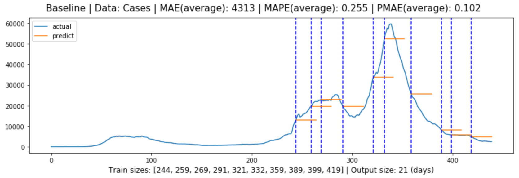
Figure (5.1)-(5.2) contain the global evaluation of baseline model for cases and deaths forecasting.
Figure 5.1: Global evaluation of baseline model for cases forecasting in line with Section 3.6.1.4.
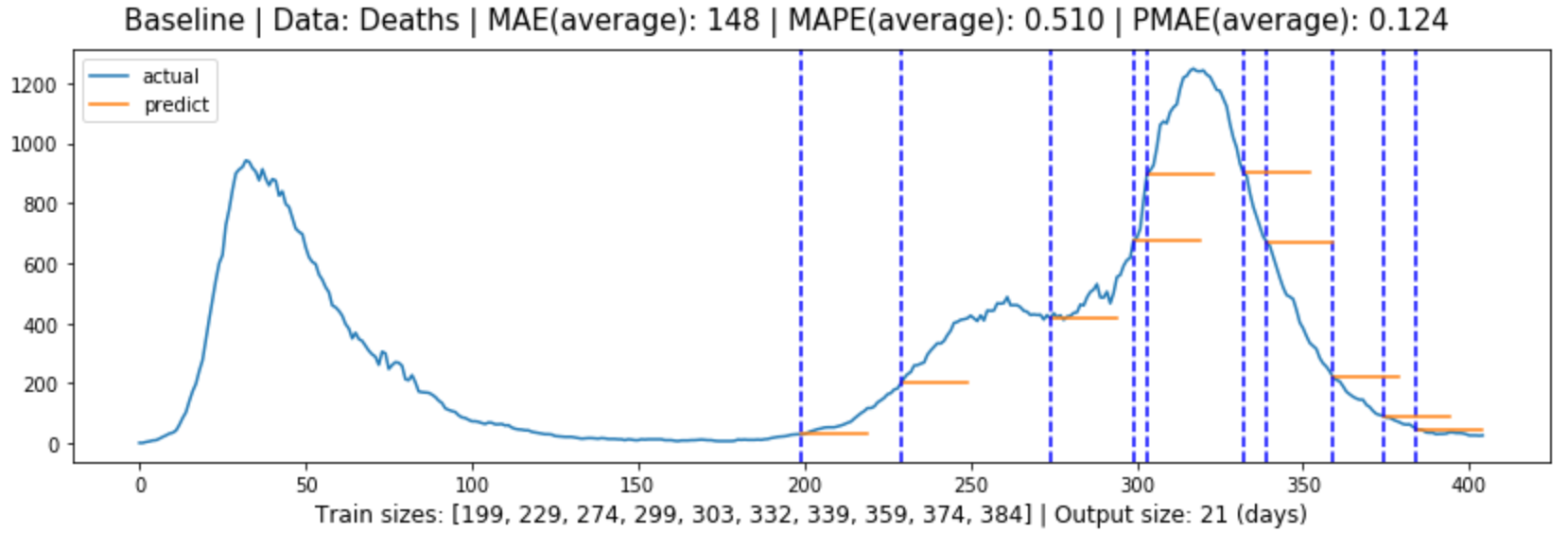
Figure 5.2: Global evaluation of baseline model for deaths forecasting in line with Section 3.6.1.4.
5.1.2 LSTM Model
5.1.2.1 Univariate LSTM Model
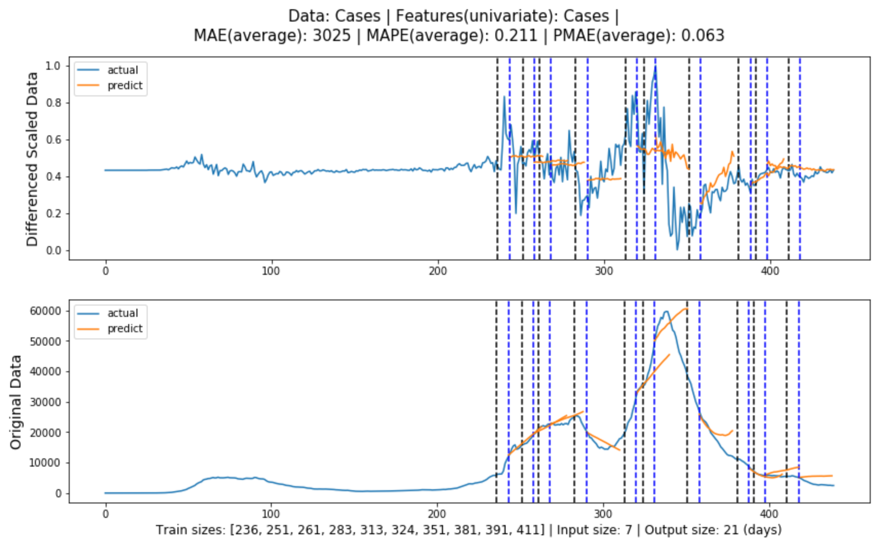
Figure (5.3)-(5.4) contain the global evaluation of baseline model for cases and deaths forecasting.
Figure 5.3: Global evaluation of univariate LSTM model for cases forecasting in line with Section3.3.1.
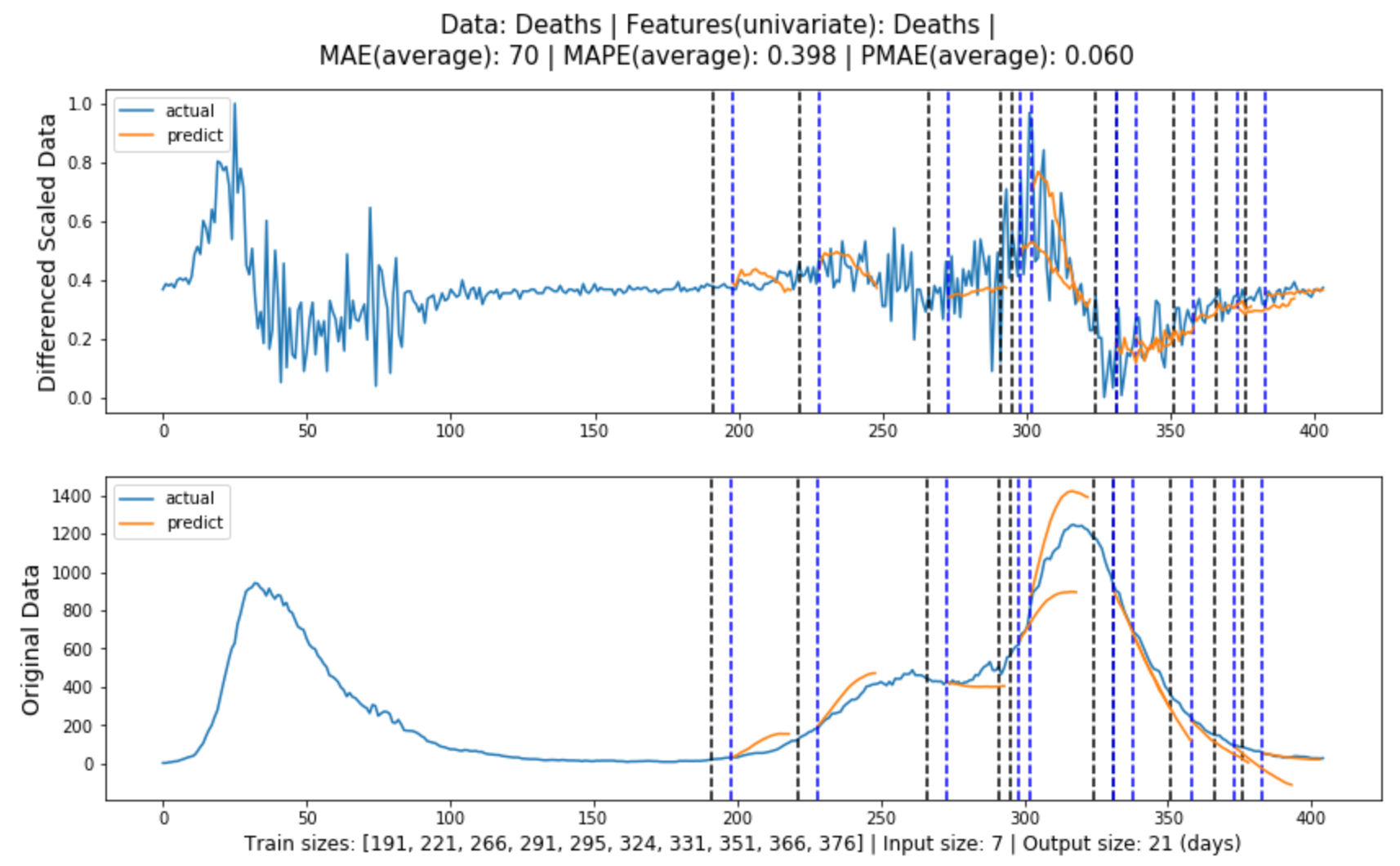
Figure 5.4: Global evaluation of univariate LSTM model for deaths forecasting in line with Section3.3.1.
5.1.2.2 Multivariate LSTM Model
Figure (5.5)-(5.6) contain the global evaluation of multivariate LSTM model for cases and deaths forecasting, where the model features are obtained from Experiment
4.2.1.3 respectively.
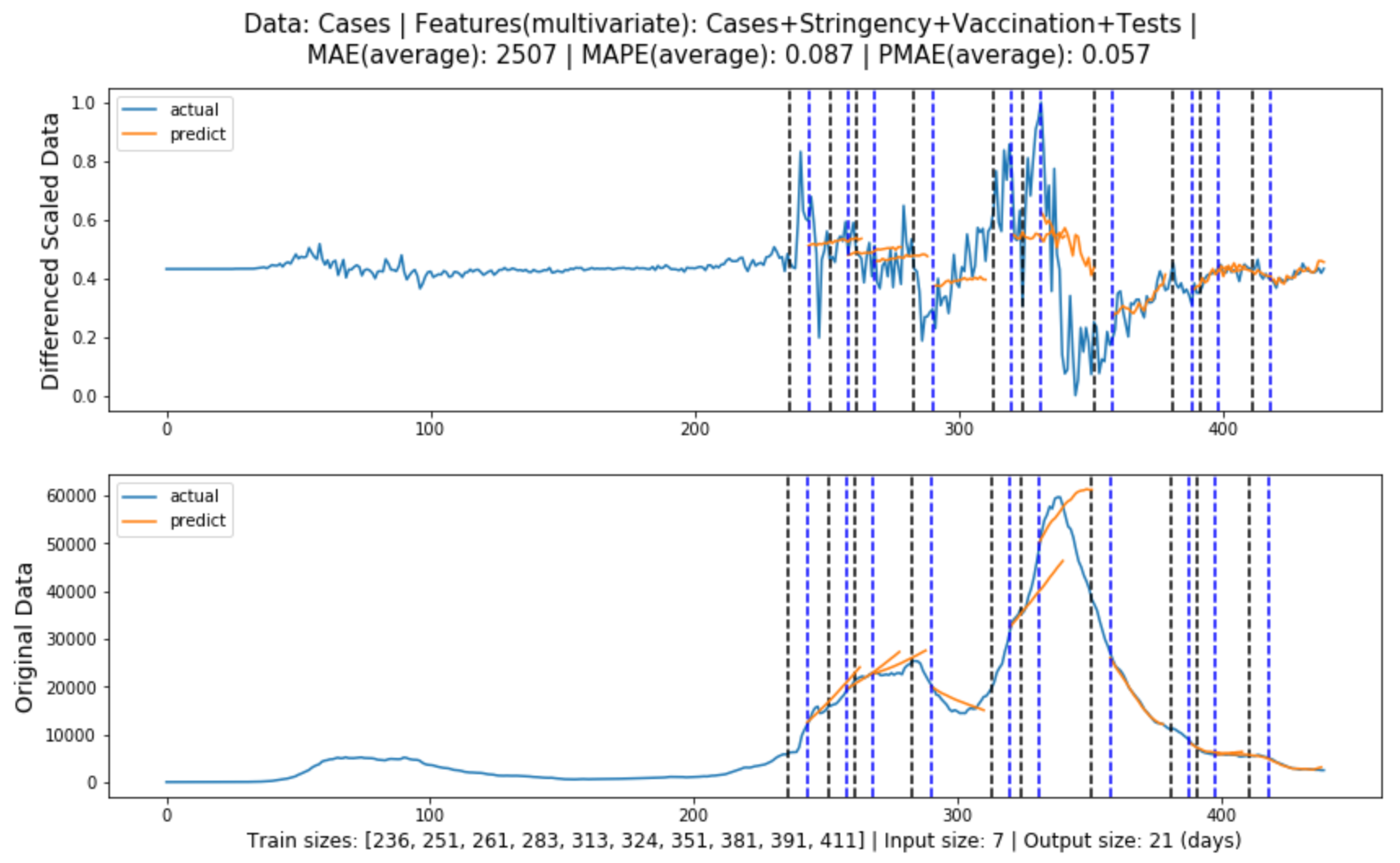
Figure 5.5: Global evaluation of multivariate LSTM model for cases forecasting in line with Section 3.3.1.
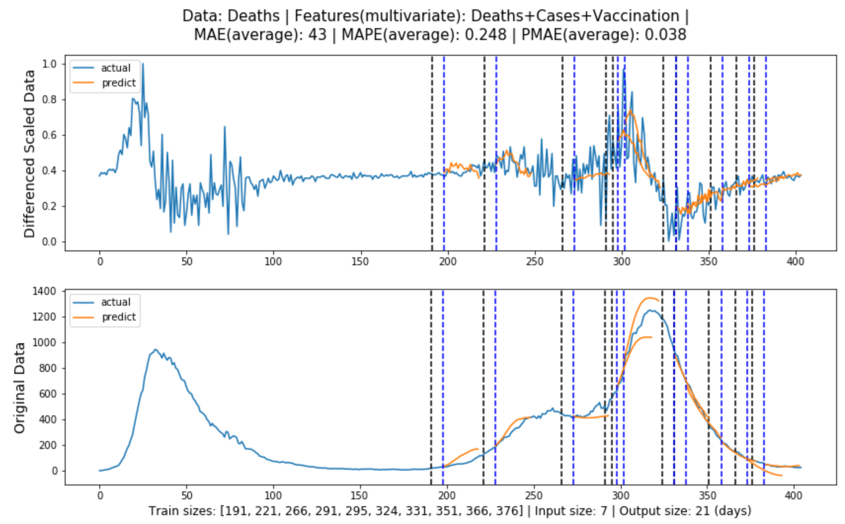
Figure 5.6: Global evaluation of multivariate LSTM model for deaths forecasting in line with Section 3.3.1.
5.1.3 ARIMA Model
Figure (5.7)-(5.8) contain the global evaluation of ARIMA model for cases and deaths forecasting.
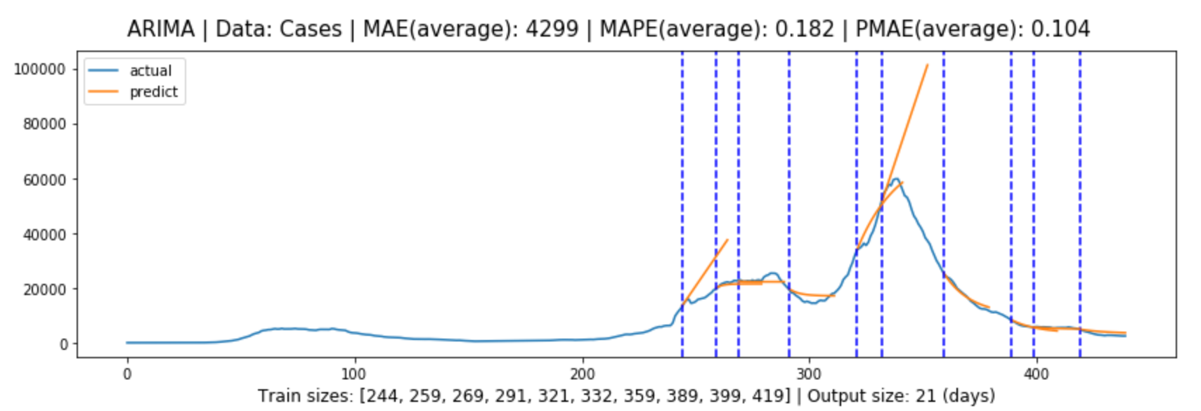
Figure 5.7: Global evaluation of ARIMA model for cases forecasting in line with Section 3.3.2.
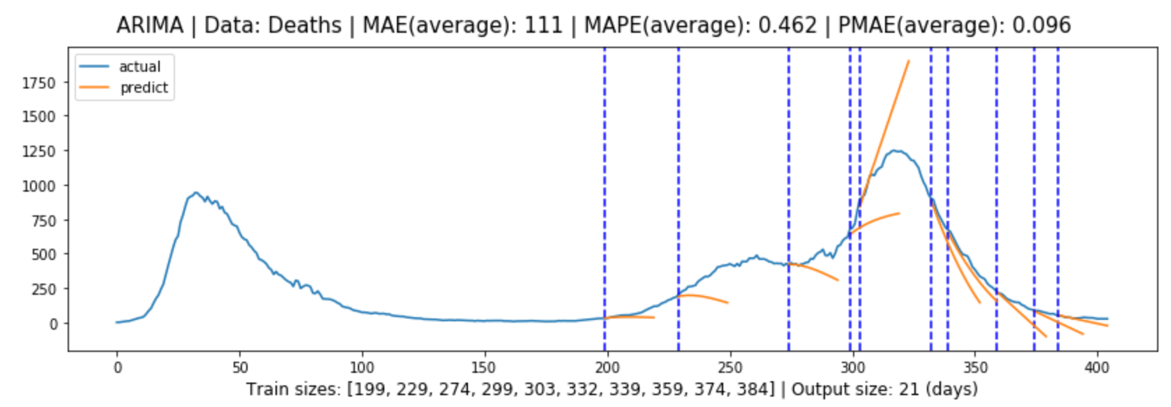
Figure 5.8: Global evaluation of ARIMA model for deaths forecasting in line with Section 3.3.2.
5.1.4 Results and Discussion
Models/
Metrics
Cases
Deaths
AMAE
AMAPE
APMAE*
AMAE
AMAPE
APMAE*
Baseline
4313
25.5%
10.4%
148
51.0%
12.4%
ARIMA
4299
18.2%
10.2%
111
46.2%
9.6%
LSTM(univariate)
3025
21.1%
6.3%
70
39.8%
6.0%
LSTM(multivariate)
2507
8.7%
5.7%
43
24.8%
3.8%
Table 5.1: Forecasting evaluation results for each model.
Table 5.1 shows the forecasting evaluation results for each model, and we can tell that:
Multivariate LSTM models performed the best in both cases and deaths forecasting, with prediction errors of 5.7% and 3.8% or an accuracy of 94.3% and 96.2% respectively.
The models generally performed better in deaths forecasting than in cases forecasting.
In both cases and deaths forecasting, the models performed from the best to the worst: multivariate LSTM model, univariate LSTM model, ARIMA model, Baseline model.
The difference between ARIMA model performance and LSTM performance is greater than the difference between univariate and multivariate LSTM model performance.
Further information can be obtained by referring to the graphs:
LSTM models generally produce more accurate predictions as they progress, presumably because in most cases they rely heavily on training data, and the more data that is input, the better the model will be trained.
The improvement of the multivariate LSTM model over the univariate LSTM model for cases forecasting is that it ensures that the general trend is correct, whereas the improvement of the multivariate LSTM model over the
univariate LSTM model for deaths forecasting is that it fits better and is more accurate.
The ARIMA model performs well when the trend of the data is not significant, but performs poorly when the trend of the model changes significantly, and this is where it falls short of the LSTM model.
There are also two potential reasons why the LSTM models performed better in cases forecasting than in deaths forecasting:
The deaths data from the first lockdown was highly volatile, with fluctuations comparable to those in the second wave, and so provided effective learning samples for the model, whereas the cases data was less volatile in the
first lockdown, so the model did not learn enough information.
The historical cases data had a more decisive impact on deaths forecasting, while the additional features used for cases forecasting were not as influential.
5.2 Dashboard
As described in Section 3.6.2, a questionnaire with two sets of questions was used to assess the dashboard from two aspects: information and usability. Fifteen participants were recruited to complete
the questionnaire, including five from non-technical backgrounds. Although this is not a large sample size, according to Nielsen Norman Group[51], a sample of only
five people can provide enough insights, so the results of the questionnaire should be sufficiently valuable. The complete questionnaire can be found in Appendix A.
5.2.1 Information
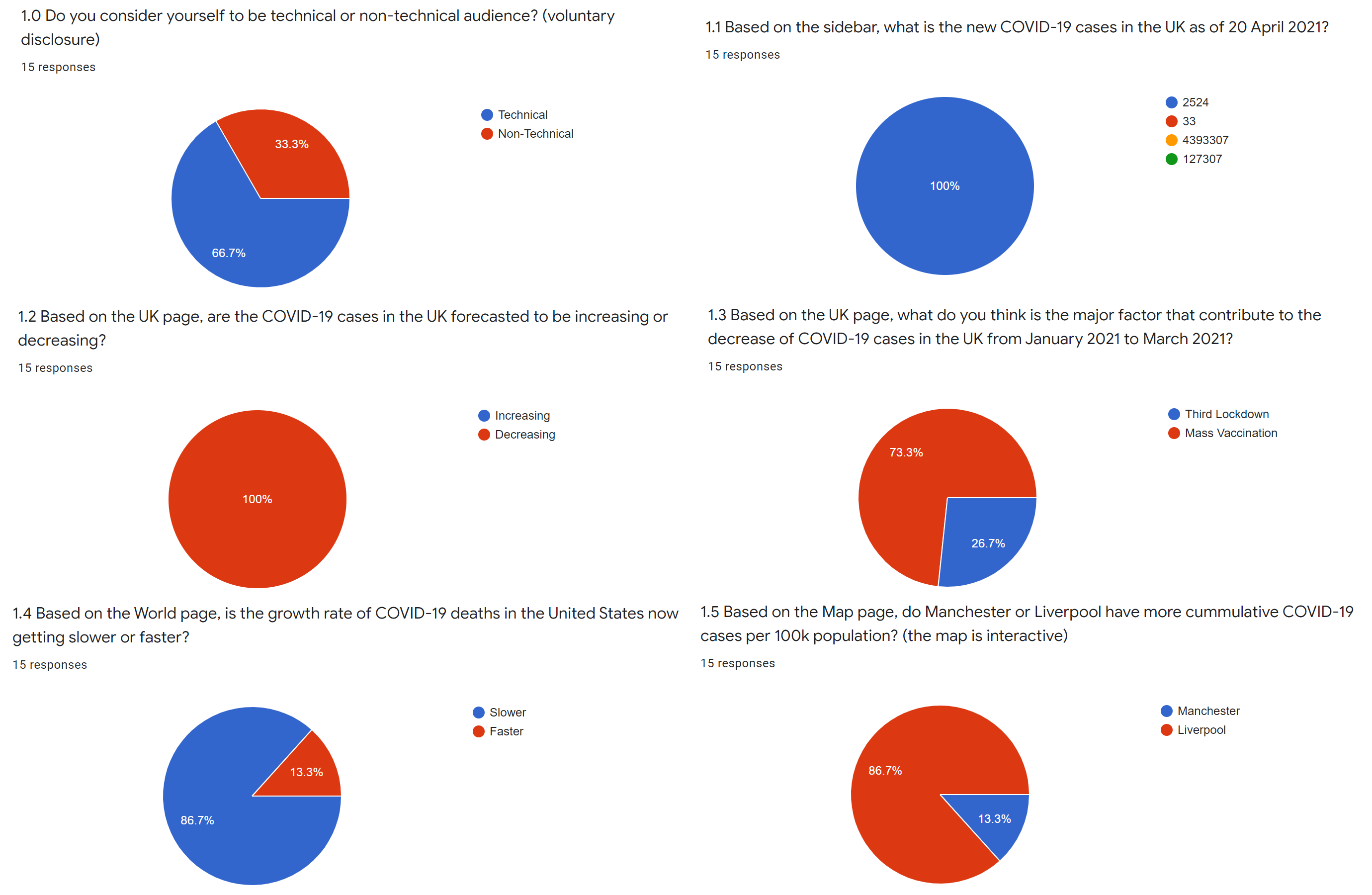
The five questions in this section and the percentage of participants who answered them correctly are as follows:
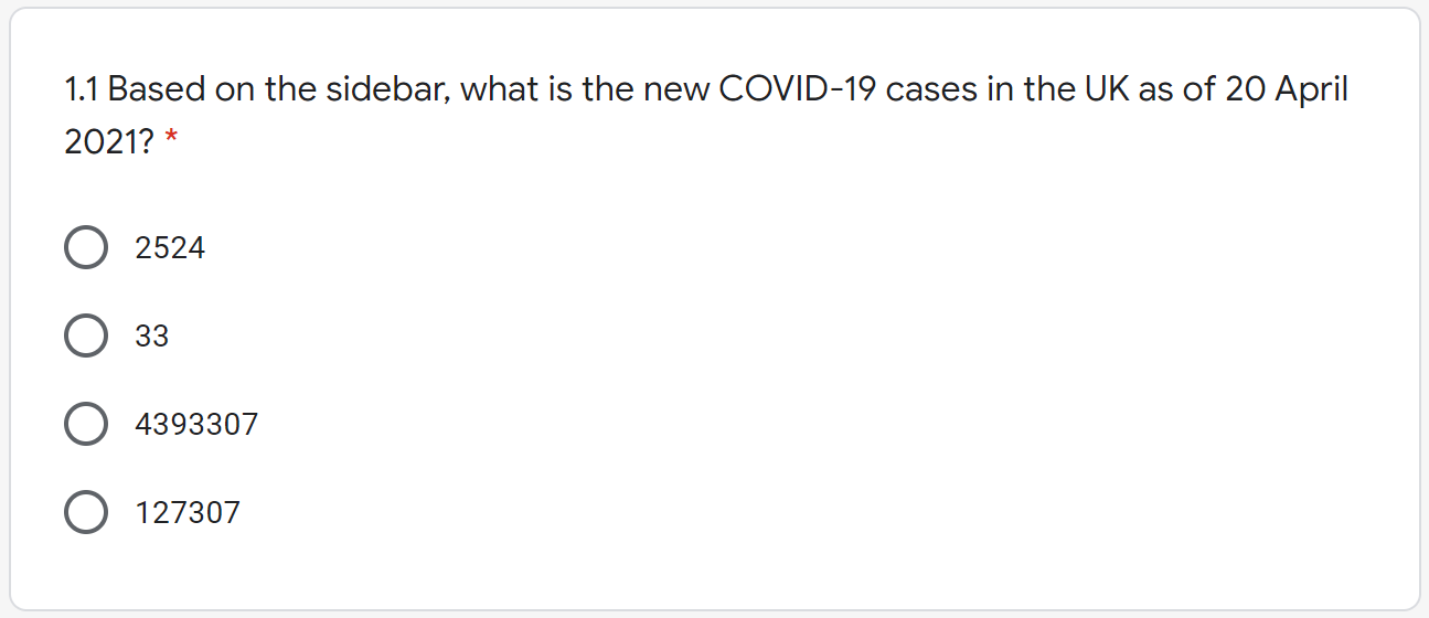
Based on the sidebar, what is the new COVID-19 cases in the UK as of 20 April 2021? (100%)
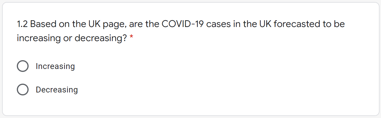
Based on the UK page, are the COVID-19 cases in the UK forecasted to be increasing or decreasing? (100%)
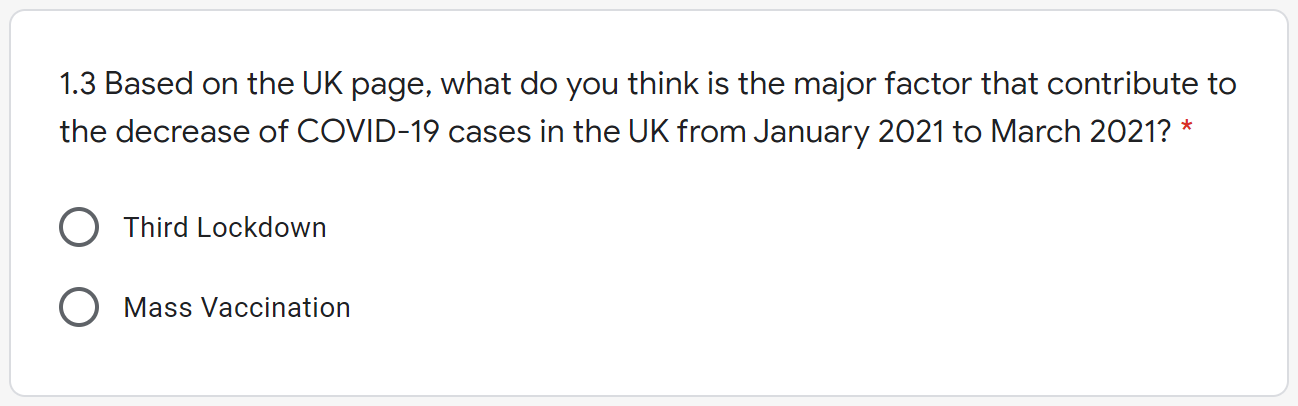
Based on the UK page, what do you think is the major factor that contribute to the decrease of COVID-19 cases in the UK from January 2021 to March 2021? (73%)
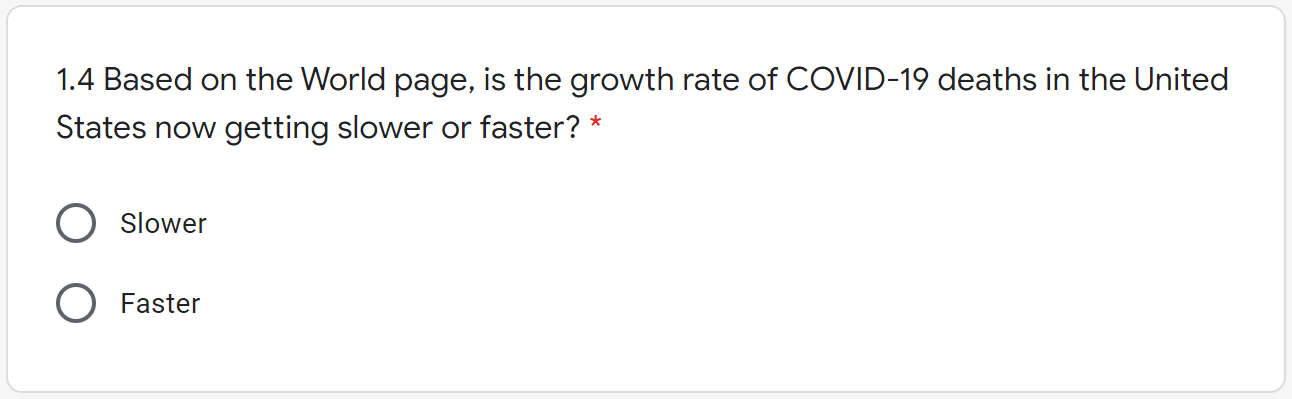
Based on the World page, is the growth rate of COVID-19 deaths in the United States now getting slower or faster? (87%)
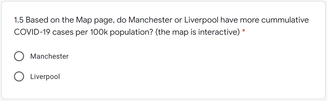
Based on the Map page, do Manchester or Liverpool have more cumulative COVID-19 cases per 100k population? (87%)
The first two questions were to assess the presentation of basic information, including the latest figures in the UK and the model predictions, both of which were answered 100% correctly.
The third question was to assess the visualisation of the major events described in section 3.4.1. We can refer to Figure 4.6 to understand this question. The third lockdown
was annotated shortly before turning point, so some may assume that this was the main factor for the decrease in COVID-19 cases since January 2021, however, if we look at the whole graph we will see that there was a delay
between the imposition of the lockdown and the decrease in cases, and in this case the mass vaccination programme was the main factor. 73% of participants answered it correctly, so the visualisation of the major events also
performed well.
Both of the last two questions were answered correctly by 87% of participants, which were also very good results. These two questions assessed the visualisation of the World Overview and the UK Maps according to Sections
3.4.2 and 3.4.3. Notably, in the fifth question the data for Manchester and Liverpool were extremely close (9567.9 and 9717.5 respectively), but most participants were
unaffected, which also demonstrated the robustness of the dashboard.
The overall accuracy for these five questions is 89%, so it is fair to say that the dashboard performed very well in presenting the information. Figure 5.9 shows the responses to each question.
Figure 5.9: Responses to each information related question.
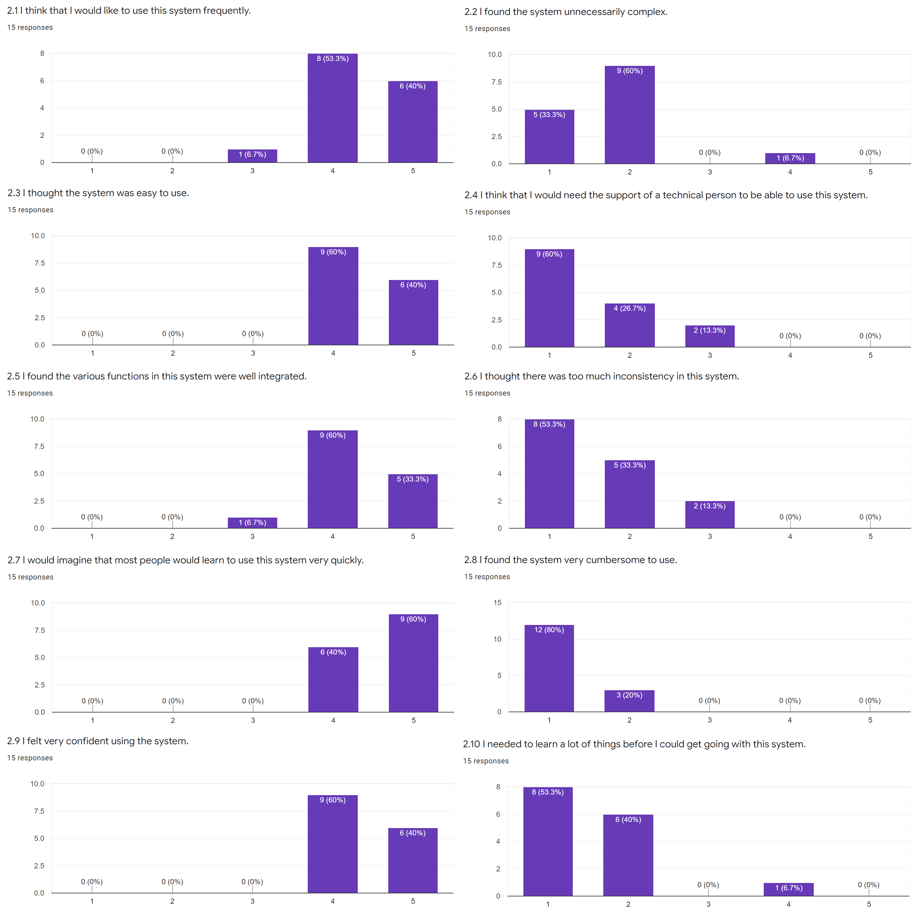
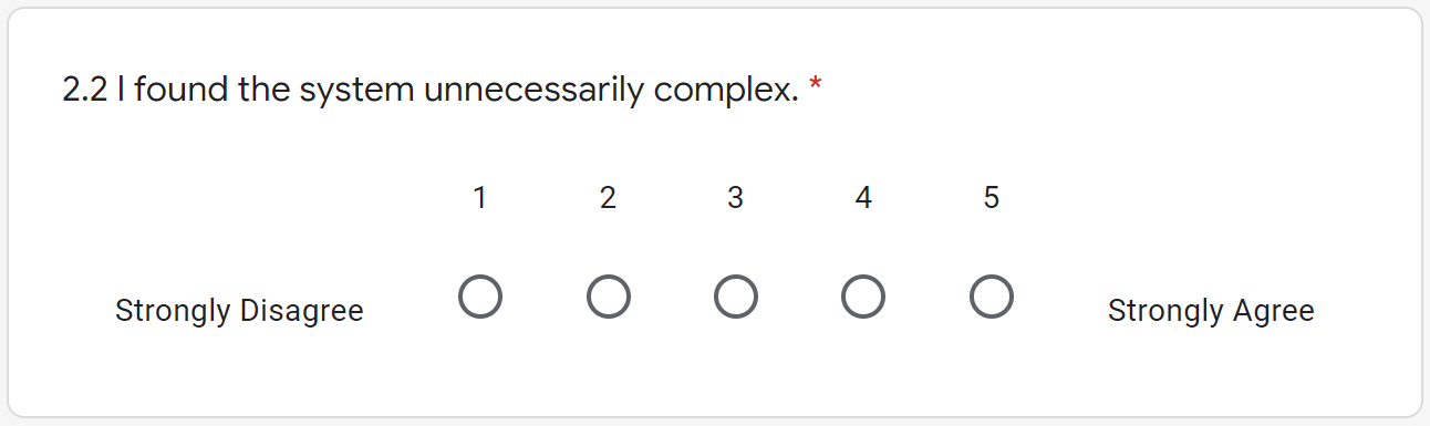
5.2.2 Usability
The questions in this section followed the System Usability Scale (SUS) standard[44]. It has 10 standard questions that measures the usability of a system in three aspects:
effectiveness, efficiency and satisfaction; each question will be answered using Likert scale (linear rating scale ranging from 1 representing “strong disagree” to 5 representing “strongly agree”). The SUS standard has proven
valid and effective[45], and Figure 5.10 shows the responses to each question.
Figure 5.10: Responses to each usability related question.
We can tell from the responses that most participants were satisfied with the system and found it easy to use.
There is also a quantitative measure to interpret the responses: the SUS Score[52], which can be calculated as shown in Equation
(5.1)-(5.3).
The total score is 100 and each question is weighted 10 points. The rationale behind the calculation is intuitive: standardise the calculation scale for positive and negative questions, sum them up and scale to 100. Based on a
research[53], the SUS scores can be interpreted as shown in Table 5.2.
The final SUS score (the average from all responses) for my dashboard is 84.9, while a score of 68 is the average and over 80.3 is considered excellent. Based on the results, it is fair to say that the dashboard also performed
very well in terms of usability.
Chapter 6 Conclusion
6.1 Summary of Achievements
Referring to the aims and objects set out in Chapter 1, here is a summary of the achievements:
An exploration of multivariate datasets for deep learning (LSTM) models and found that the use of government stringency, vaccination and testing data improved the accuracy of COVID-19 cases forecasting, while vaccination and
historical cases data improved the accuracy of COVID-19 deaths forecasting.
The implementation of the optimal multivariate LSTM and ARIMA models for COVID-19 cases and deaths forecasting in the UK and provided three-week forecasts with 95% confidence intervals. The LSTM models outperformed the ARIMA
models, with prediction accuracies of 94.3% and 96.2% for cases and deaths, respectively, compared to 89.8% and 90.4%.
Informative visualisation of UK COVID-19 cases and deaths data, with annotated key events and model predictions, as well as map visualisation of COVID-19 cases and deaths per 100,000 population in different Upper Tier Local
Authorities (UTLA), and a clear overview of the trends in COVID-19 cases and death growth rates in different countries worldwide.
The integration of above contents in a dashboard which performed very well both in presenting information and having good usability, with a SUS score of 84.9. The dashboard is deployed on AWS and is publicly accessible at:
https://covid-19.shangjielyu.com/
6.2 Social Usefulness
The COVID-19 (forecasting) Dashboard has practical usefulness in our lives, including:
Governments: A medium-term forecast of COVID-19 cases can inform policy decisions, such as lockdowns and various other measures; exploration of multivariate datasets can
also suggest what data to focus on when assessing the situation and developing strategies.
Healthcare Departments: By understanding the COVID-19 scenarios and trends, the health sectors can arrange equipment and resources accordingly, thereby saving more lives.
Businesses: Being informed about where COVID-19 is heading means that businesses can prepare accordingly in advance of possible government measures, such as managing
inventory and expenditure to reduce costs; it also means that economic recovery will be accelerated.
Individuals: Knowing about COVID-19 outbreaks locally, nationally and worldwide also has various benefits for individuals, including making plans such as working from home
or travelling; it also means that the public awareness of the COVID-19 pandemic will be enhanced.
Furthermore, the detailed methodology can be easily transferable for future pandemics; to some extent, this project has contributed directly or indirectly to Sustainable Development Goal (SDG) 3 (good health and well-being).
6.3 Limitations and Future Work
Although the project has overall achieved its aims and objectives, it has limitations:
The models are still not optimal and although I tested various features as input data, there are other factors that were not fully tested or optimised, such as the hyperparameters of the models, the length of the inputs and
outputs, and the different variants of the models.
Only UK level forecasts are available, but not regional level forecasts as well.
Although users can select models on the dashboard, there are no model descriptions, which can be difficult to understand for non-technical audiences.
Therefore, I would like to proceed with the following work in the future:
As suggested in Section 5.1.4, one potential reason why models performed better in deaths forecasting than in cases forecasting is that the features used in deaths forecasting had a more decisive
impact on accuracy. I would like to explore more types of data and identify any other features that could improve the accuracy of COVID-19 cases and deaths forecasting.
To further improve the performance of the LSTM models, I will focus on the three aspects: optimising the hyperparameters using methods such as Bayesian optimisation, evaluating all reasonable combinations of input and output
lengths and identify the patterns, experimenting with LSTM’s variants such as Bi-LSTM, ED-LSTM and Stacked LSTM.
Extend the forecasting data and methodology to also include forecasting for different regions and potentially focus on Manchester to provide more of a city-level insights.
Provide a description of the forecasting methods in the dashboard, including the rationale for the models and the types of data used, to make it more accessible.
6.4 Challenges and Adaptations
I have faced various challenges in this project, including:
Data Sources: As described in Section 2.1, unlike the vast majority of countries, the UK did not publish COVID-19 recoveries data, thus largely
limiting the viable options for modelling.
LSTM Model Engineering: As suggested in Section 3.2.1, LSTM models are input sensitive and a lot of experiments had to be carried out before
finding the suitable pre-processing methods as described in Section 3.2; these experiments did not provide feedback and with a lack of prior domain knowledge of deep learning, the process was in a
sense tedious and pessimistic.
Dashboard: At the beginning I did not have any experience using the framework described in section 4.4 and I had to learn everything from
scratch.
I also had to adapt my approaches when facing obstacles:
Model Selection: I started out building various traditional supervised learning models using
Scikit-learn[54], as well as a time series-focused method called Prophet[55], open-sourced by Facebook, neither of which provided good results; I
then conducted other experiments as well before deciding to use LSTM and ARIMA models.
Map Visualisation: According to section 3.4.3, I first visualised the map using Kepler.gl[56],
Uber’s open sourced map visualisation tool, with promising results. Unfortunately, the map could not be integrated into the dashboard due to some Python packages conflicts and I had to restart the process and build the maps
with Plotly (and learned how to do so). However, the work produced with Kepler.gl was not just abandoned, it was proceeded with separately and is available at: (COVID-19 Infections Map, with a screenshot attached in Appendix
B)
https://covid-map.shangjielyu.com/
Deployment: The project was first deployed on Heroku[57], but Heroku only allowed programs that could be
started within a 30 second run-time limit; as the project became larger, I had to find alternative deployment methods and eventually opted for AWS.
6.5 Reflective Conclusions
In conclusion, this project has achieved its aims and objectives and I have proposed a roadmap for the future work to overcome its limitations. And I would also like to share some other thoughts.
We are getting so used to the convenience offered by various predictive models and dashboards that we may not even realise how incredible these efforts are. I have had some conversations with the team behind the Public Health
England’s Developers API, which was one of my main data sources. At one point I couldn’t resolve a connection error with the API and raised an issue on their official GitHub
repository[58] to ask about it, and I received a reply shortly afterwards that it was due to the high traffic and server limitations, especially in
the South West England, but they were planning to expand the server capacity.
This happened in the early stages of my project and I never had such problems later. It was only then that I realised how valuable and important their work was. I would also like to use this opportunity to express my gratitude
to them, and to all the teams that are behind these projects.
This project has also enhanced my knowledge and understanding of how technology should be applied to life and I will continue to make my contributions.
References
[1]
“Covid-19 vaccine: First person receives Pfizer jab in UK”, en-GB, BBC News, Dec. 2020. [Online]. Available:
https://www.bbc.com/news/uk-55227325 (visited on 04/30/2021).
[2]
O. N. Bjørnstad, K. Shea, M. Krzywinski, and N. Altman, “The SEIRS model for infectious disease dynamics”, en, Nature Methods, vol. 17, no. 6, pp. 557–558, Jun. 2020, Number: 6
Publisher: Nature Publishing Group, issn: 1548-7105. doi:
10.1038/s41592-020-0856-2. [Online]. Available:
https://www.nature.com/articles/s41592-020-0856-2 (visited on 04/28/2021).
M. Maleki, M. R. Mahmoudi, D. Wraith, and K.-H. Pho, “Time series modelling to forecast the confirmed and recovered cases of COVID-19”, en, Travel Medicine and Infectious Disease, vol.
37, p. 101 742, Sep. 2020, issn: 1477-8939. doi:
10.1016/j.tmaid.2020.101742. [Online]. Available:
https://www.sciencedirect.com/science/article/pii/S1477893920302210
(visited on 04/20/2021).
S. Shastri, K. Singh, S. Kumar, P. Kour, and V. Mansotra, “Deep-LSTM ensemble framework to forecast Covid-19: An insight to the global pandemic”, en,
International Journal of Information Technology, Jan. 2021, issn: 2511-2112.
doi: 10.1007/s41870-020-00571-0. [Online]. Available:
https://doi.org/10.1007/s41870-020-00571-0 (visited on 04/20/2021).
A. Barman, “Time Series Analysis and Forecasting of COVID-19 Cases Using LSTM and ARIMA Models”, en, p. 16,
[9]
N. Yudistira, “COVID-19 growth prediction using multivariate long short term memory”, arXiv:2005.04809 [cs, stat], May 2020, arXiv: 2005.04809 version: 2. [Online]. Available:
https://arxiv.org/abs/2005.04809 (visited on 04/28/2021).
[10]
R. Chandra, A. Jain, and D. S. Chauhan, “Deep learning via LSTM models for COVID-19 infection forecasting in India”, arXiv:2101.11881 [cs, stat], Jan. 2021, arXiv: 2101.11881 version:
1. [Online]. Available: https://arxiv.org/abs/2101.11881 (visited on 04/24/2021).
[11]
A. B. Said, A. Erradi, H. Aly, and A. Mohamed, “Predicting COVID-19 cases using Bidirectional LSTM on multivariate time series”, arXiv:2009.12325 [cs], Sep. 2020, arXiv: 2009.12325
version: 1. [Online]. Available: https://arxiv.org/abs/2009.12325 (visited on 04/28/2021).
G. E. P. Box, G. M. Jenkins, G. C. Reinsel, and G. M. Ljung Time Series Analysis: Forecasting and Control, en. John Wiley & Sons, May 2015,
Google-Books-ID: rNt5CgAAQBAJ, isbn: 978-1-118-67492-5.
[20]
A. R. S. Parmezan, V. M. A. Souza, and G. E. A. P. A. Batista, “Evaluation of statistical and machine learning models for time series prediction: Identifying the state-of-the-art and the best conditions for the use of
each model”, en, Information Sciences, vol. 484, pp. 302–337, May 2019, issn: 0020-0255.
doi: 10.1016/j.ins.2019.01.076. [Online]. Available:
https://www.sciencedirect.com/science/article/pii/S0020025519300945 (visited on
04/29/2021).
[21]
Y. Rizk and M. Awad, “On extreme learning machines in sequential and time series prediction: A non-iterative and approximate training algorithm for recurrent neural networks”, en,
Neurocomputing, vol. 325, pp. 1–19, Jan. 2019, issn: 0925-2312.
doi: 10.1016/j.neucom.2018.09.012. [Online]. Available:
https://www.sciencedirect.com/science/article/pii/S0925231218310737 (visited on
04/29/2021).
[22]
T. Hale, N. Angrist, R. Goldszmidt, B. Kira, A. Petherick, T. Phillips, S. Webster, E. Cameron-Blake, L. Hallas, S. Majumdar, and H. Tatlow, “A global panel database of pandemic policies (Oxford COVID-19 Government
Response Tracker)”, en, Nature Human Behaviour, vol. 5, no. 4, pp. 529–538, Apr. 2021, Number: 4 Publisher: Nature Publishing Group,
issn: 2397-3374. doi:
10.1038/s41562-021-01079-8. [Online]. Available:
https://www.nature.com/articles/s41562-021-01079-8 (visited on 04/25/2021).
[23]
F. Arroyo-Marioli, F. Bullano, S. Kucinskas, and C. Rondón-Moreno, “Tracking R of COVID-19: A new real-time estimation using the Kalman filter”, en, PLOS ONE, vol. 16, no. 1, e0244474,
Jan. 2021, Publisher: Public Library of Science, issn: 1932-6203. doi:
10.1371/journal.pone.0244474. [Online]. Available:
https://journals.plos.org/plosone/article?id=10.1371/journal.pone.0244474
(visited on 04/25/2021).
S. Ramírez-Gallego, B. Krawczyk, S. García, M. Woźniak, and F. Herrera, “A survey on data preprocessing for data stream mining: Current status and future directions”, en,
Neurocomputing, vol. 239, pp. 39–57, May 2017, issn: 0925-2312.
doi: 10.1016/j.neucom.2017.01.078. [Online]. Available:
https://www.sciencedirect.com/science/article/pii/S0925231217302631 (visited on
04/25/2021).
[26]
R. J. Hyndman and G. Athanasopoulos Forecasting: principles and practice, English, 2nd edition. OTexts, May 2018,
isbn: 978-0-9875071-1-2.
[27]
D. P. Kingma and J. Ba, “Adam: A Method for Stochastic Optimization”, en, Dec. 2014. [Online]. Available:
https://arxiv.org/abs/1412.6980v9 (visited on 04/28/2021).
L. Prechelt “Early Stopping - But When?”, en, in Neural Networks: Tricks of the Trade, ser. Lecture Notes in Computer Science, G. B. Orr and K.-R. Müller, Eds., Berlin, Heidelberg:
Springer, 1998, pp. 55–69, isbn: 978-3-540-49430-0. doi:
10.1007/3-540-49430-8˙3. [Online]. Available:
https://doi.org/10.1007/3-540-49430-8_3 (visited on 04/26/2021).
[30]
I. Goodfellow, Y. Bengio, and A. Courville Deep Learning, English, Illustrated edition. Cambridge, Massachusetts: The MIT Press, Nov. 2016,
isbn: 978-0-262-03561-3.
[31]
N. Srivastava, G. Hinton, A. Krizhevsky, I. Sutskever, and R. Salakhutdinov, “Dropout: A Simple Way to Prevent Neural Networks from Overfitting”, Journal of Machine Learning Research, vol. 15, no. 56, pp. 1929–1958, 2014, issn: 1533-7928. [Online]. Available:
https://jmlr.org/papers/v15/srivastava14a.html (visited on 04/26/2021).
[32]
R. Mushtaq “Augmented Dickey Fuller Test”, en, Social Science Research Network, Rochester, NY, SSRN Scholarly Paper ID 1911068, Aug. 2011. doi:
10.2139/ssrn.1911068. [Online]. Available:
https://papers.ssrn.com/abstract=1911068 (visited on 04/27/2021).
R. J. Hyndman and Y. Khandakar, “Automatic Time Series Forecasting: The forecast Package for R”, en, Journal of Statistical Software, vol. 27, no. 1, pp. 1–22, Jul. 2008, Number: 1,
issn: 1548-7660. doi:
10.18637/jss.v027.i03. [Online]. Available:
https://www.jstatsoft.org/index.php/jss/article/view/v027i03 (visited on 04/27/2021).
[35]
T. G. Smith and others Pmdarima: ARIMA estimators for Python, 2017. [Online]. Available:
https://alkaline-ml.com/pmdarima/ (visited on 04/26/2021).
[36]
Plotly: The front end for ML and data science models. [Online]. Available:
https://plotly.com/ (visited on 04/27/2021).